


Hey @eduardosgn 👋🏻
I have some suggestion about accessibility and some other things.
- First, in
alttags avoid using words like logo, illustration, etc, because screen readers read them aslogo Huddle logoand it becomes redundant. - Also,
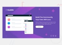
<img src="./images/illustration-mockups.svg" alt="Illustration">, should havearia-hidden="true"because it's only for decoration. - Next, I'd suggest using percentage for
width, instead of pixels, for example the following lines of the code will give some white space to the overall project:
.page__container {
    width: 90%;
    min-height: 100vh;
    margin: 0 auto;
}
Moreover, avoid using fixed heights because they're bad for responsiveness. I recommend using min-height, which will give your desired result and also let the height grow if the size of the content grows.
I hope this was helpful 👨🏻💻 other than that, you did a great job, one last suggestion would be to try to make it responsive for tablet viewport width as well. Cheers 👾
Marked as helpful
0
Eduardo Nascimento• 140
@eduardosgn
Posted
@kens-visuals Thanks for the tips!! very helpful
1
