


P
ApplePieGiraffe• 30,545
@ApplePieGiraffe
Posted
Hey, Joel! 👋
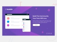
Good work on this challenge! 👍 Your solution looks great and is responsive! 👏
One or two suggestions I have are,
- Turning the social media links in at the bottom of the page into actual links by wrapping each of them in a link tag.
- Using
background-size: coverfor the background image in this challenge so that it does not appear to be squeezed or stretched when the size of the screen changes.
It can be challenging to make designs look good for all screen sizes! What you have here is good, though. I think you can allow the illustration to shrink in a size a bit more in the desktop layout so that you can switch to the mobile layout a bit later. In the mobile layout, you might be able to increase the max-width of the content just so that it takes up a bit more space when the layout first changes (but not too much)! 😉
Hope this helps. 😊
Keep coding (and happy coding, too)! 😁
Marked as helpful
2

