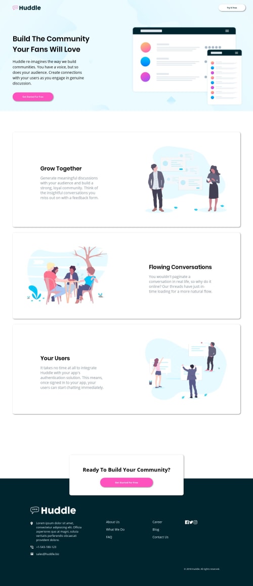
Submitted about 5 years agoA solution to the Huddle landing page with alternating feature blocks challenge
Huddle Landing Page Using HTML 5/CSS/GRID/FLEXBOX

@SJ-Nosrat
Solution retrospective
This was a definite challenge!
Any feedback is appreciated.
Any ideas on how to set the layout for the iPad and other tablets?
Thanks in advance!!!
Code
Please log in to post a comment
Log in with GitHubCommunity feedback
- @rfilenko
Hi, you can use tablet specific media queries like:
- @media (min-width: 768px) and (max-width: 1024px) { ##Device = Tablets, Ipads (portrait) ##Screen = B/w 768px to 1024px }
- @media (min-width: 768px) and (max-width: 1024px) and (orientation: landscape) { ##Device = Tablets, Ipads (landscape) ##Screen = B/w 768px to 1024px }
Roman

Join our Discord community
Join thousands of Frontend Mentor community members taking the challenges, sharing resources, helping each other, and chatting about all things front-end!
Join our Discord