Not Found
Not Found
Not Found
Not Found
Not Found
Not Found
Not Found
Not Found
Not Found
Not Found
Not Found
Not Found
Not Found
Not Found
Not Found
Not Found
Not Found
Not Found
Not Found
Not Found

Submitted

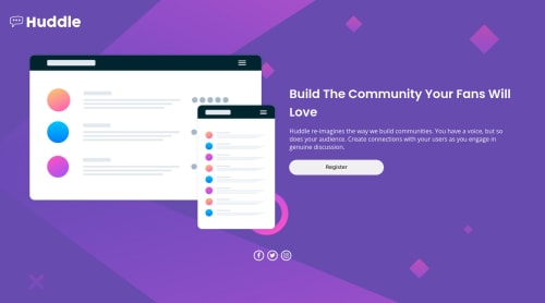
Huddle landing page with mobile first approach

Vinayak• 30

@d-vinayak


Design comparison


SolutionDesign

Solution retrospective


I am not able to position social icons to the right bottom side for desktop version. I will be really grateful if someone tells me what I am doing wrong plus any additional feedback will be really helpful for me

Community feedback

tomthestrom• 165

@tomthestrom

Posted

As @marik999 points out, you could position them horizontally along the main axis using justify content: flex-end; and using some margin or padding, right now you're positioning them to where they are using justify content: center;, that's why they are in the center.

By the way, speaking about the social media icons, it's cool you decided to put them into a <ul> element, that makes for some nice semantic HTML! But in my opinion it would be better to have each social media icon as a standalone list item (<li>) instead of having just one <li> with 3 child elements, that basically defeats the semantic approach introduced by using ul and li for these social media icons.

Take care, Tom

1

Vinayak• 30

@d-vinayak

Posted

I see. How can I make each list items position horizontally instead of default vertical position?

0
Adam• 430

@aemann2

Posted

For the social icons, I made the right side of the page its own div, set the height to 100vh, and made it flex container. Then I put a wrapper around everything except the social icons:

  .main {
    height: 100vh;
    display: flex;
    align-items: center;
    justify-content: center;
  }

  .flex-wrapper {
    flex: 1;
    display: flex;
    flex-direction: column;
    justify-content: center;
  }

As you can see, I set the flex to 1 for the wrapper. I wrapped my icons in their own div within .main, and because they're a flex child of the .main container, I set their flex property to 0 and used flex-end and margin to align them:

    &__icons {
      flex: 0;
      align-self: flex-end;
      margin-right: 5rem;
    }

Setting their div to flex: 0 is the key to making this work: it causes the .flex-wrapper container to expand and pushes the icons down to the bottom of the page. You can take a look at my code if you want more clarification.

Also, for your body element on your desktop, add in background-size: cover. This will make your background image cover the entire page.

1

Vinayak• 30

@d-vinayak

Posted

That's an interesting approach. I too kinda wrapped everything except icons in a separate div, however I am not much familiar with flex:0/1 property as I am still beginner. I will surely look into that property and will also try to do it by using your approach. And yeah I forgot to put cover to background size. Thanks a lot. :-)

0
manik• 70

@manik999

Posted

You can justify-content: flex-end in the links class and then give the required padding-right say 5vw. Then you can justify it center at your mobile break point and remove the padding.

1

Vinayak• 30

@d-vinayak

Posted

Thanks, it worked. Earlier I was trying to modify 'align-item' property, but now my confusion is cleared.

0

Please log in to post a comment

Log in with GitHub
Discord logo

Join our Discord community

Join thousands of Frontend Mentor community members taking the challenges, sharing resources, helping each other, and chatting about all things front-end!

Join our Discord