Not Found
Not Found
Not Found
Not Found
Not Found
Not Found
Not Found
Not Found
Not Found
Not Found
Not Found
Not Found
Not Found
Not Found
Not Found
Not Found
Not Found
Not Found
Not Found
Not Found

Submitted

Huddle Landing Page with Sass

@shubhamthedev
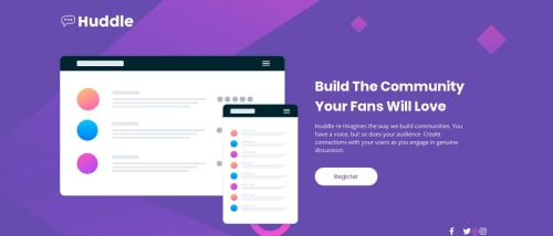

Design comparison


SolutionDesign

Solution retrospective


Hi, this is my third project over here and i want some feedback on this project. I am open to any suggestions you might have and any criticism about my design or the style of coding.

Community feedback

P
AjeaS 585

@AjeaSmith

Posted

Hi Shubham!, Great work on this project! just a few suggestions

  • I noticed the design breaks a bit when it gets to 914px I would suggest the media query break point to be before then.

  • I see within your code you use the header tag to wrap your whole content. Probably just a preference thing, but I usually use the header tags for menu-like content like nav bars, and logos. Then I would use either the main tag or a section tag for regular content.

  • The last thing I noticed is that there is a script tag at the top, inside the head tag. It's best practice to place any script tags at the bottom of the page, namely right above the ending </body> tag. That way when the browser runs, it loads the content first then any JS scripts.

Other than that, again great job! :) keep up the good work.

P.S. Hope this makes sense

2

@shubhamthedev

Posted

@AjeaSmith hey thanks for the feedback, I will probably fix the 914px break-point and yes i prefer <nav> for navigation and <header> for the first page and I've placed the tag in the head because font awesome gives weird validation errors if placed at the end.

1
P
Matt Studdert 13,611

@mattstuddert

Posted

Hey Shubham, great work on this challenge! As Ajea mentioned, there is a small responsive issue, but nothing major. Also, you could add borders to the social icons to try getting it as close to the design as possible.

You're using Sass really well with the variables, nesting, and mixins. Have you ever tried using min-width media queries instead of max-width? It's quite a common workflow with front-end developers to use them and work mobile-first. It can often lead to less CSS code and has the benefit of loading in fewer styles for mobile users, which can be a nice performance gain.

It's been great to see you diving in and giving feedback to others as well. You've been giving great advice. Thanks for being such a supportive member of the community!

Let me know if you have any questions. Keep up the great work! 👍

1

@shubhamthedev

Posted

@mattstuddert hi, thanks for the feedback and I'll try my next project using min-widthprobably as a challenge and i have just one question for you, how are the screenshots for the site i make being taken because i went into the console and found that the size of the screenshot is 900px by 376px but at this screen size my design should be completely different yet the screenshot is still in landscape orientation.

0
P
Matt Studdert 13,611

@mattstuddert

Posted

@tomboynotes we use Pupeteer to generate the screenshots. It can sometimes have issues with the vh unit and position: absolute; when calculating the height of the screenshots. The screenshot is taken at 1440px width, which is the same as the design width, so even though they are displayed at 900px width in the design comparison they would both scale down to an equal level.

1

@shubhamthedev

Posted

@mattstuddert Okay i got that thanks for the help.

0
P
Matt Studdert 13,611

@mattstuddert

Posted

@tomboynotes you're welcome!

0

Please log in to post a comment

Log in with GitHub
Discord logo

Join our Discord community

Join thousands of Frontend Mentor community members taking the challenges, sharing resources, helping each other, and chatting about all things front-end!

Join our Discord