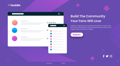
Huddle landing page with single intro section

Please log in to post a comment
Log in with GitHubCommunity feedback
- @MarlonPassos-git
hello suraj, some suggestions for your project:
- Put the backgrounds on the body and use
background-size: cover;to cover the entire desktop area andbackground-size: contain;in the mobile version - You could break to mobile version a little earlier, there are times when your image gets too small
- Add a border to social network elements to look more like the original version
- The logo could be inside a <header> tag and the content of the image and texts inside a <main> tag
- The footer should be at the bottom of the page, you can solve this by adding a grid to the body, and setting the footer to
justify-self: end; align-self: end, if you have any doubts on how to do this take a look at this solution https://huddle-landing-page-with-single-introductory-section-96lkg2nms.vercel.app/
Marked as helpful - Put the backgrounds on the body and use
Join our Discord community
Join thousands of Frontend Mentor community members taking the challenges, sharing resources, helping each other, and chatting about all things front-end!
Join our Discord