Not Found
Not Found
Not Found
Not Found
Not Found
Not Found
Not Found
Not Found
Not Found
Not Found
Not Found
Not Found
Not Found
Not Found
Not Found
Not Found
Not Found
Not Found
Not Found
Not Found

Submitted

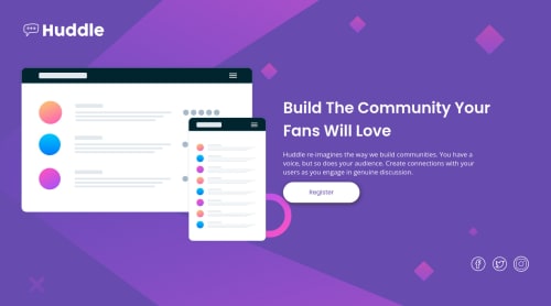
huddle landing page with single introductory section
#accessibility
Finney 3,030

@Finney06


Design comparison


SolutionDesign

Solution retrospective


Any suggestion on improving my code with HTML and CSS best practice.

Community feedback

@binthroot

Posted

I would push your footer down with a margin-top, then make your footer a flexbox and put all three of your icons in a div and push the div to the end. Here's a rough idea.

<footer class='flexbox justify-content-end margin-top:til-it-looks-good'> (pushes all the icons over) <div class='flexbox justify-content-space-between'> (spaces icons out with flexbox) <icon><icon><icon> </div> </footer>

Something like that. I used the class names to kind of explain the CSS involved.

Marked as helpful

1

Please log in to post a comment

Log in with GitHub
Discord logo

Join our Discord community

Join thousands of Frontend Mentor community members taking the challenges, sharing resources, helping each other, and chatting about all things front-end!

Join our Discord