Not Found
Not Found
Not Found
Not Found
Not Found
Not Found
Not Found
Not Found
Not Found
Not Found
Not Found
Not Found
Not Found
Not Found
Not Found
Not Found
Not Found
Not Found
Not Found
Not Found

Submitted

huddle-landing-page-with-alternating-feature-blocks-master

@neehanthreddy01


Design comparison


SolutionDesign

Solution retrospective


Share your feedback on this solution...? Thank you šŸ˜Š

Community feedback

P
Emmilie Estabilloā€¢ 5,540

@emestabillo

Posted

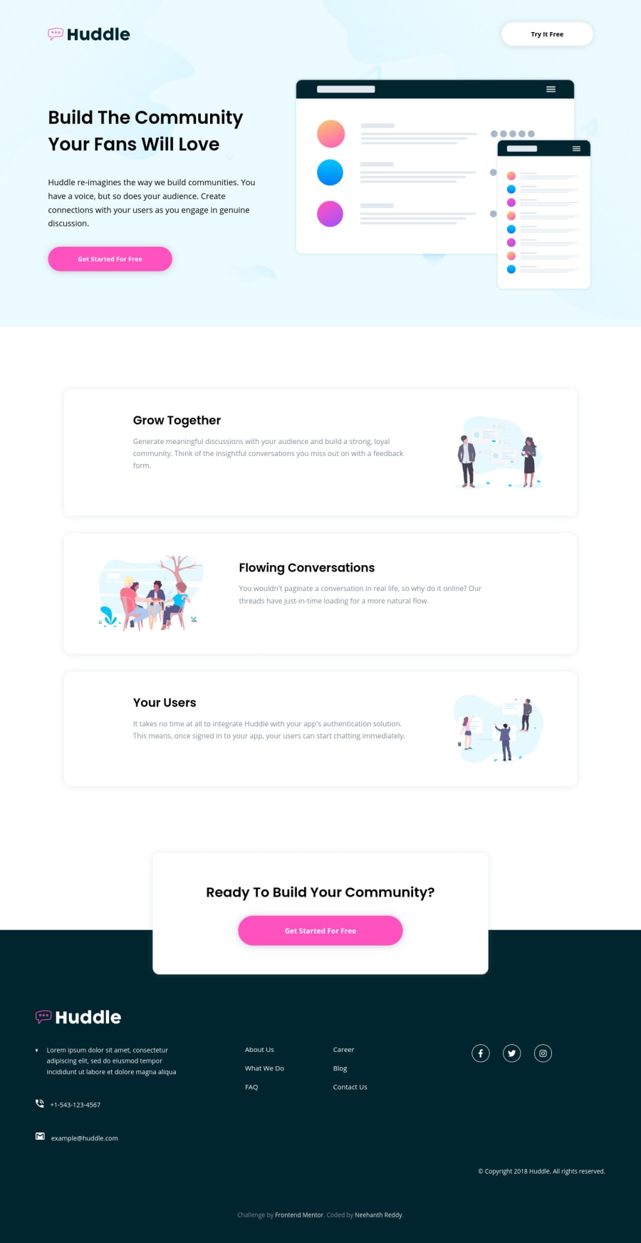
Hi @neehanthreddy01, you've done a great job here! Just saw a few things on the 888px breakpoint:

  • The Get Started button on the header looks off

  • The items in the .nav-box div looks squished. I would try removing margin-right: 110px; from the flex items and add column-gap: 2rem (or any value you prefer) to the parent div

  • The left and right paddings on the text for the .content boxes could be adjusted so they don't appear much taller than the images

  • I'd also convert the email and phone into clickable elements

Hope this helps :-)

0

Please log in to post a comment

Log in with GitHub
Discord logo

Join our Discord community

Join thousands of Frontend Mentor community members taking the challenges, sharing resources, helping each other, and chatting about all things front-end!

Join our Discord