I used all that I learned in two days of HTML and CSS.

Solution retrospective
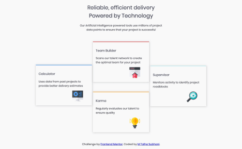
I tried to make it responsive but couldn't make it. I used all that I learned in two days of HTML and CSS.
Please log in to post a comment
Log in with GitHubCommunity feedback
- @mattstuddert
Nice work on this challenge, especially as someone who has only been learning HTML and CSS for two days! 👍
As @KeelanJon mentioned, I'd recommend looking into Flexbox and Grid instead of using
position: absolute;. There are some great learning resources for them on the resources page if you want to start looking at them.Keep up the great work! 🙂
- @KeelanJon
Very good try for a two-day learner! I noticed your solution uses absolute positioning and isn't mobile responsive.
For your next steps, I'd recommend looking into CSS Flexbox and then onto CSS Grid to easily produce a mobile responsive layout without the need for absolute positioning.
Absolute positioning creates the issue of removing your elements from the HTML flow, meaning they ignore all other content and end up overlapping on smaller devices.
Hope to see an updated solution from you soon!
Keelan
- @MOHAMMED-ABD-RAZAQ
very good my friend but the distance between card to larges best washes


Join our Discord community
Join thousands of Frontend Mentor community members taking the challenges, sharing resources, helping each other, and chatting about all things front-end!
Join our Discord