


Aleem Akinyoola• 60
@Aleemcode
Posted
Really enjoying Tailwind @mattstuddert and I don't want to look back again. It's making my dev life easier. Thanks for the review, I will look into the recommendations.
0
Looking to hire developers?
What material can you recommend to learn how to show menu on mobile by clicking the hamburger menu.
@Aleemcode
Posted
Really enjoying Tailwind @mattstuddert and I don't want to look back again. It's making my dev life easier. Thanks for the review, I will look into the recommendations.
@mattstuddert
Posted
Hey Aleem, nice work on this challenge! You'll need some JavaScript for the mobile navigation. I would recommend just Googling "JavaScript mobile navigation example" as there are so many great resources on how to do it.
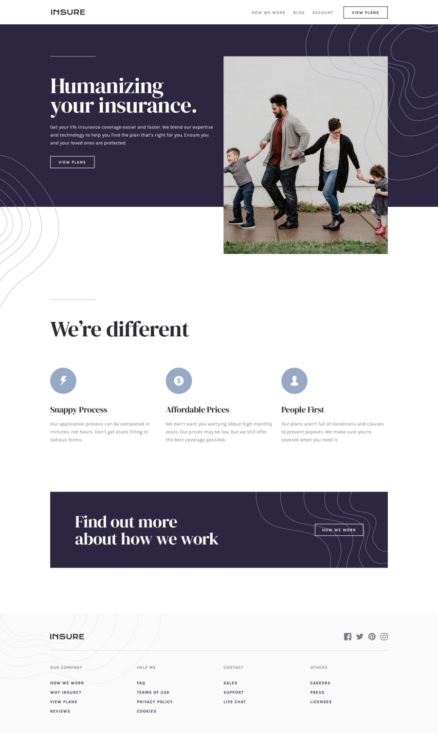
Just a quick heads up that I'd recommend avoiding using the vh unit too much. You've got it on your introductory region and it can easily break the layout of the site. For example, keep your screen at full width and then change the height of your browser. You'll see the content begins to overflow its container. You can remove the max-height: 65vh; style and then just use margin and padding to handle the spacing.
Also, I'd recommend reviewing tablet sizes for your solution. If you put your screen to 640px up to a medium tablet size you'll see the content looks very squashed.
Overall you've done a really good job. It's nice to see you using Tailwind. Are you enjoying it?
Join thousands of Frontend Mentor community members taking the challenges, sharing resources, helping each other, and chatting about all things front-end!
Join our Discord
