


P
Matt Studdert• 13,611
@mattstuddert
Posted
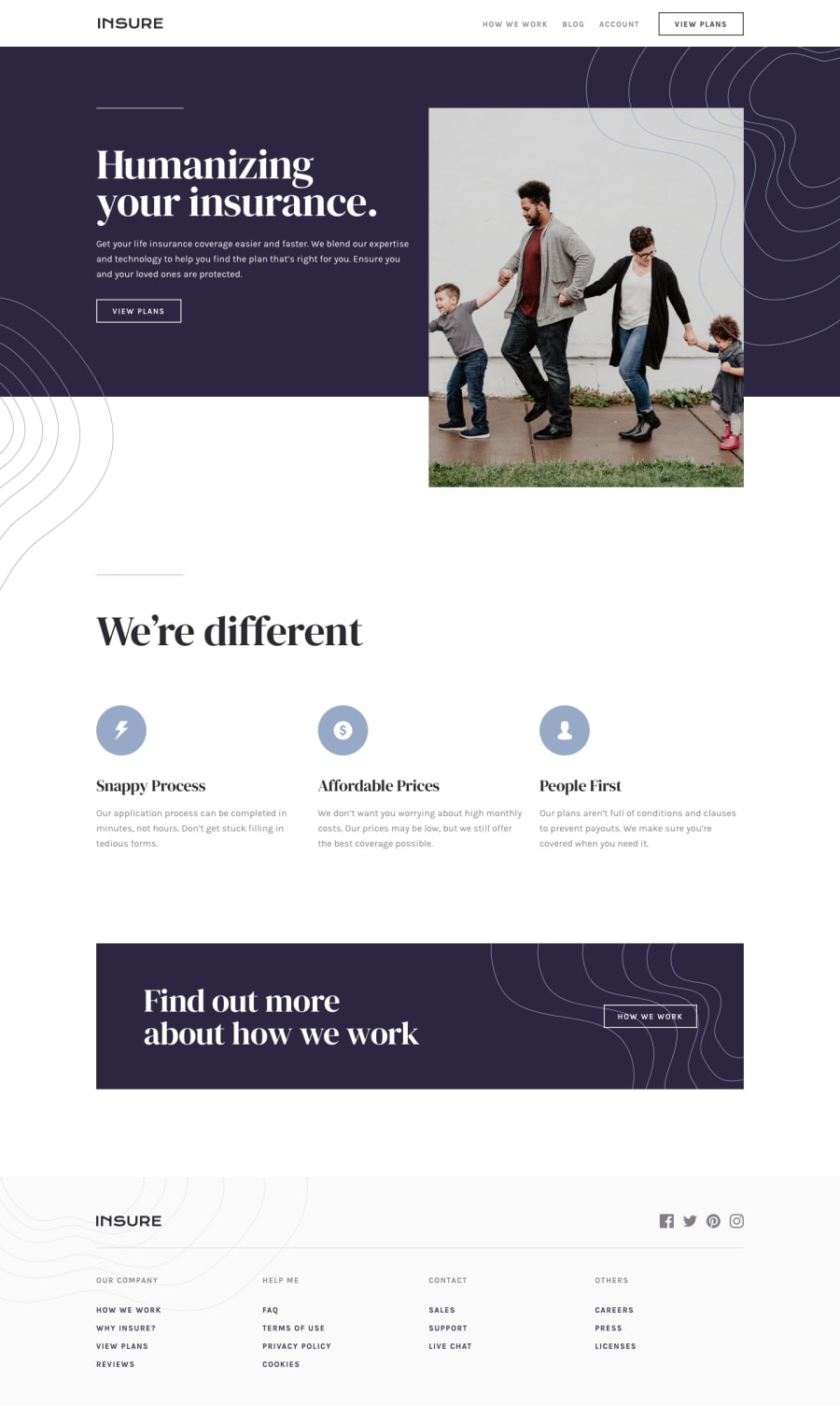
Hey Khyati, nice work on this challenge! Your overall layout looks great. As you can see by the design comparison there are just a few areas like some of the spacing and font-weight that are slightly off. Accuracy is a key part of being a front-end developer, so it's a skill that's well worth taking some time to build.
Also, I'd recommend reviewing the responsiveness of your solution. If you put your screen to 501px you'll notice that everything is very squashed. This continues up to a mid-large tablet size. To have a truly responsive website it should look good on a wide range of device sizes, so this would be worth refining.
Great work on this though. You've done a really good job. I hope my tips help! 🙂
1
