Interactive rating component - Vanilla Javascript

Solution retrospective
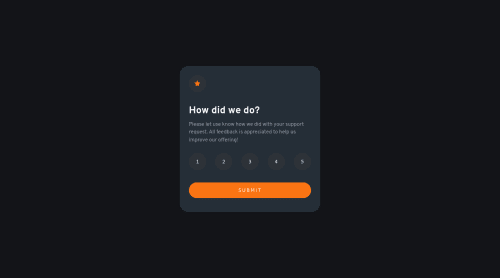
Here is my solution for the challenge.
I wonder which html element is the best to use for the ratings. I choose button, it makes it keyboard accessible but not sure about the semantic. Feedback welcome and happy coding !
Please log in to post a comment
Log in with GitHubCommunity feedback
- P@GregLyons
I think
<button>elements are acceptable in this case, precisely because it makes it more keyboard accessible as you say. It's definitely better than using something that's not inherently keyboard-focusable like a<div>. However I believe the most semantic HTML element would be an<input type="radio">since that's precisely what the rating system is. Then, you can allow even more keyboard controls (arrow keys, I believe) by grouping them using a<fieldset>element (which you can style like a<div>). See this link for more information. This is probably best since you want your elements to be semantically grouped as well, and I'm not sure whether a<div>accomplishes that. It's pretty tricky to style the radio inputs to look like the design, though--I myself haven't fully learned it--whereas with<button>'s it's a lot easier.Also, if you use a
<fieldset>you should add a<legend>heading as well. Then you'd need to remove the outline on the<fieldset>(you can see it in the examples in the above link) and make the<legend>hidden to be in-line with the given design. Read this for a useful way to make form labels visually hidden but still accessible via screen readers (the latter of whichdisplay: none;doesn't achieve).Another example of this grouping would be with
<ul>and<li>elements; when screen readers encounter a<ul>element, they'll even read of the number of list items in the list based on the number of<li>'s. This wouldn't happen by making a list of<p>elements wrapped by a<div>, for example.Hope this helps, and good job!
Marked as helpful - @isprutfromua
Hi there. You did a good job 😎
keep improving your programming skills🛠️
your solution looks great, however, if you want to improve it, you should fix these issues:
✅ empty alternative texts
✅ elements must have sufficient color contrast. Ensures the contrast between foreground and background colors meets WCAG 2 AA contrast ratio thresholds
<button class="submit">SUBMIT</button>I hope my feedback will be helpful. You can mark it as useful if so 👍 it is not difficult for you, but I understand that my efforts have been appreciated
Good luck and fun coding 🤝⌨️
Marked as helpful


Join our Discord community
Join thousands of Frontend Mentor community members taking the challenges, sharing resources, helping each other, and chatting about all things front-end!
Join our Discord