


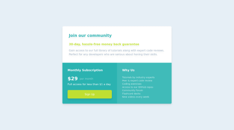
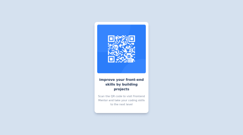
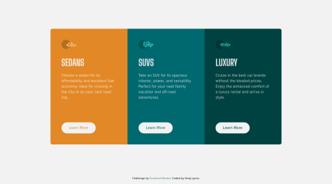


The thing that went well for me I feel like I made good progress with the basic functionality of the project, especially the QR code generation and its presentation. The layout of the page looks great on larger screens. I also made sure to follow a clean, semantic structure using HTML5 and CSS, which I’m happy with. Additionally, I tried to use Flexbox for layout, and they helped me manage the design quite well on different screen sizes.
What i will do differently next time Next time, I plan to focus more on the mobile-first approach when it comes to responsive design. I’ll start by designing for smaller screens first and then progressively enhance the design for larger screens. I also want to experiment more with CSS frameworks like Bootstrap or CSS variables to help streamline the process. Additionally, I’ll invest more time in testing on actual devices and use browser developer tools to fine-tune responsiveness.
What challenges did you encounter, and how did you overcome them?The biggest challenge for me was ensuring that the layout was fully responsive on all screen sizes. Initially, the design broke on smaller screens. I struggled with some of the media queries, and it took me a while to adjust the layout for different breakpoints. For example, text and images sometimes overlapped or weren’t sized properly. I also had trouble with ensuring consistency across devices—what looked great on my desktop often didn’t work as expected on mobile.
how i overcome them
-
Mobile-first approach: I switched to a mobile-first approach, which meant I started designing for the smallest screens and worked my way up to larger ones. This helped me focus on making sure the core layout and elements would work well on mobile devices first.
-
Adjusting media queries: I experimented with different breakpoints to ensure that the layout adapted properly to various screen sizes. By targeting common device widths (like 320px for mobile, 768px for tablets, and 1024px for desktops), I was able to create a smoother transition between screen sizes. but i ended up using only (365px for mobile and 1440px for desktop) which was provided for me in the style-guide.md
-
Flexible images and text: I used max-width for images and relative units like
%,em, andremfor font sizes. This made the design more fluid and ensured that content resized dynamically, preventing elements from overlapping or being cut off. -
Testing on real devices: I also took extra time to test the design on real devices, not just using browser developer tools. This helped me catch issues I might have missed in the simulated environment, such as touch targets being too small or images not scaling correctly.
I’m seeking feedback on how to enhance the responsiveness of my design. Specifically, I’m struggling with:
- Ensuring text and images scale properly on smaller screens.
- Handling different aspect ratios and screen resolutions.
- Best practices for setting breakpoints in media queries—how do you determine the right breakpoints for different screen sizes?
Any advice or recommendations would be greatly appreciated!


