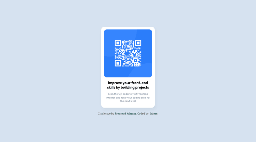
QR Component using sass and flexbox

Solution retrospective
I'm not sure what I need for the right accessibility, feedback about that topic is more then welcome.
Please log in to post a comment
Log in with GitHubCommunity feedback
- P@GregLyons
Good work! You're using semantic HTML (
<h1>for heading,<p>for body text), which is all you need in terms of accessibility for this challenge.I'll give you a few pointers I keep in mind when thinking about accessibility. Since this is your first challenge, I can't really assess what you know in terms of accessibility, so forgive me if I'm saying things you already know. My tips will mainly revolve around using semantic HTML, which is the idea of writing your HTML in a way that can be more easily understood by machines (e.g. screen readers for human comprehension, search engine crawlers for SEO, etc.).
1) Headings Semantically,
<h1>-<h6>elements denote sections on your web page. You should have precisely one<h1>on any given web page, which serves as its title. Then, your heading levels should decrease by one. That is, the heading of every section thereafter should have an<h2>, the subsections of those sections should have<h3>headings, and so on. A common mistake is that people will look at the appearance of a heading in a design, and assign it to<h3>or<h4>based on that, when semantically (i.e. the meaning), the heading introduces a main section of the page; in this case, it should actually be an<h2>. Remember that you can always style headings as you desire, so the HTML (i.e. which heading element) you use should reflect the meaning of the heading on the page, not the visual design you've been given.Another reason this is useful is that a lot of screen readers allow users to navigate the page by going to different landmark elements. For example, they can go to the next
<h2>, or the next<h3>, etc. Thus, if two sections are the same level in the logic of the document, you should give them the same heading level (even if the headings are styled differently).2) ARIA roles To help screen readers understand your web page, there are many different attributes like
aria-*, e.g.aria-role. For example, if you put anaria-role="button"on a<div>, screen readers will interpret the<div>as a button, which then indicates to the user, who may have trouble/may not be able to see your web page, that they can press it. Without this role, there's no indication (aside maybe visual indication) that the<div>can be interacted with.The thing is, different HTML elements have certain
aria-*properties by default. For example, a<button>element already hasaria-role="button"built in, so screen readers will interpret as a button without you needing to remember to add the appropriate ARIA role! Thus, using semantic HTML makes it a lot easier to make your websites accessible.3) Lists Think about which content on your page is semantically a list. For example, in a lot of Frontend Mentor challenges, you'll see a series of cards on the landing page describing the features of a product. I like to make these into lists using
<ul>for the parent container and<li>for the individual cards, instead of using<div>s in either case. Why? Well, the<ul>now getsaria-role="list"automatically, and each<li>getsaria-role="listitem", so screen readers can now interpret these cards as a list, which is what they are semantically: a list of features for your product.Another neat things is that, upon entering the list, screen readers will signal to the user that they're entering a list, and it'll even tell them the number of items. Imagine instead that you have a list of
<p>tags for the features of a product. A screen reader would read them one after the other, without telling the user its a list. This leads to confusion (imagine you're being read the words aloud without any breaks between items), and using an unordered/ordered list prevents this.I hope this helps! If so, feel free to mark this comment as helpful. Either way, I hope these pointers will help you write more accessible web pages. Best of luck in your future projects!
Marked as helpful
Join our Discord community
Join thousands of Frontend Mentor community members taking the challenges, sharing resources, helping each other, and chatting about all things front-end!
Join our Discord