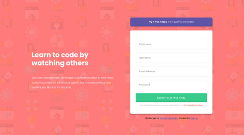
Submitted almost 3 years agoA solution to the Intro component with sign-up form challenge
Intro component with signup form using html css and js

@salmaaboudou
Solution retrospective
I've just completed this challenge. Any feedback and suggestions on how I can improve are very welcome 🤗
Code
Please log in to post a comment
Log in with GitHubCommunity feedback
- @ErayBarslan
Hey there, excellent work with your solution! Design looks good, it's responsive and form works as supposed to. There are just few things I'd add to your solution:
- By the time screen gets wider, content keeps stretching out and text eventually becomes one line and makes it harder to read. You'd want to use
max-widthon container elements so that design won't break. - When you use sectioning elements like
<section>,<article>. If there is a fitting heading It'd be better use one for accessibility. In this case you can use <h2> for Try it for free text instead of <p>. - Lastly on mobile version, there is extra padding and margin adding 40rem to top of screen. Your form is already centered so you won't need it. Aside these everything looks great and happy coding :)
Marked as helpful - By the time screen gets wider, content keeps stretching out and text eventually becomes one line and makes it harder to read. You'd want to use

Join our Discord community
Join thousands of Frontend Mentor community members taking the challenges, sharing resources, helping each other, and chatting about all things front-end!
Join our Discord