


@Maritxx
Latest solutions
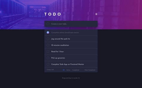
Fullstack (NextJS + ExpressJS + SocketIO + MongoDB + Cloudinary)
#express#mongodb#react#styled-components#nextSubmitted almost 3 years ago
Latest comments
- @ErayBarslan
Hey, great work on the challenge! You can use
inputeventListener to achieve that. For custom input it would be:document.getElementById("custom__button").addEventListener('input', (e) => { calculateTipAmount(e, e.target.value / 100) })You can apply the same to other inputs. Happy coding :)
- @catherineisonline@ErayBarslan
Hey Catherine, excellent work on the challenge! There is just a little gotcha about
background-size. Header has fixed height socontainwon't let the image grow as the screen gets wider. Everything else looks perfect, happy coding :) - @DHolets99@ErayBarslan
Hey Darya, design is almost pixel perfect and responsive so nothing much to add, excellent work! Some suggestions:
- Between 450-720px text and image overlaps. You can change the breakpoint for mobile to 720px. My general suggestion in this regard would be to take mobile first approach so you wouldn't be dealing overflows. Also desktop layouts are more complex than mobile. So you can achieve the same result with less code since mobile usually just 1 column layout. Although you'd still need to check desktop before styling for mobile to make the transition easier from simple layout to complex.
- Sections aren't landmark elements by default. If you wish to use as one, you need
aria-labelortitleattributes. Or you can simply use it inside<main>. - You can reduce the usage of <div>. If there is a semantic element it's always better to use one instead of div. In your case you can use
<p>for texts. Also you can get rid of nested divs like in here:
<header>
    <div class="wrapper">
      <div class="header">
        /* content */
      </div>
    </div>
  </header>
All 3 containers are parent of the content and you can achieve the same by just using
<header>without the need of divs. In regards of accessibility nested divs won't mean much because they're ignored, just there for styling purposes. Although not using unnecessary elements will keep your code more maintainable and easier to work on for others. Aside these everything looks great and happy coding :) - @andykallian@ErayBarslan
Hey Anderson. Great work on your solution! To use checkbox and style as you wish you can use
appearance: none. This is what I've used on my solution:.theme-switch { appearance: none; width: 26px; height: 26px; background-image: url('images/icon-sun.svg'); background-repeat: no-repeat; cursor: pointer; } .theme-switch:checked { background-image: url('images/icon-moon.svg'); background-position: center; }Also you can define just one class per theme on body. Example:
.dark {
    --bg-color: hsl(235, 21%, 11%);
    --bg-content: hsl(235, 24%, 19%);
}

.light {
    --bg-color: rgb(235, 235, 235);
    --bg-content: white;
}
Then add & remove with checkbox. You can use the variables on any element, switching class from body will be enough. Would make it much more easier to store in localStorage as well. Happy coding :)
- @trandainien@ErayBarslan
Hey there, congrats on your solution! Design looks good, responsive and you have clean usage of CSS. Nothing much to add but some suggestions:
- If you wish to place the attribution to bottom of page without effecting your container's placement you can use:
.attribution { ... position: absolute; bottom: 0; } body { ... justify-content: center; } /* In this case you can place your container to center */- Background color is missing on body:
background-color: var(--Very-light-gray);Although arguably white looks better so you might as well leave it as it is. - Instead using <div> on
.containerand.attributionyou can use semantic elements to make the page accessible:<main class="container">&<footer class="attribution"> - You shouldn't leave
altempty. Screen readers skips empty alt. Since images on this challenge are for decorative usage, nothing wrong regarding accessibility. But your page might get lower SEO. Instead you can use like :<img src="./images/icon-sedans.svg" alt="sedan" aria-hidden="true"/> - On production, when you dirct links with
target="_blank", addingrel="noopener noreferrer"will make it secure to attacks. Aside these nothing I'd add, happy coding :)
Marked as helpful - @Aleroms@ErayBarslan
Hey there, excellent work with the challenge! Design looks good and accessible. Your scss usage looks alright and for such project you won't need more of it's features. By the time projects starts getting bigger you can start structuring your scss files like _variables, _mixins and import to main. But would be redundant for this one. Some suggestions.
- Right now your card isn't responsive and that is due to the fixed
width: 375pxvalue on container. If you usemax-widthyou'll see it's responsive for smaller screens aswell. By defaultwidth: autowhich is taking available space to fit the content inside it. In this case you can increase the value to match the desktop design by keeping it same for 375 screen width:max-width: 450px; - There is a vertical scrollbar even though nothing overflows. That's due to the default margin on body. If you give
margin: 0to body it'll fix that. For your next projects I'd suggest resetting all padding and margin at the start of your project by using* { ... }selector. So you'd have full control over your elements. Aside these nothing I'd add, happy coding :)
Marked as helpful - Right now your card isn't responsive and that is due to the fixed


