Not Found
Not Found
Not Found
Not Found
Not Found
Not Found
Not Found
Not Found
Not Found
Not Found
Not Found
Not Found
Not Found
Not Found
Not Found
Not Found
Not Found
Not Found
Not Found
Not Found

Submitted

Landing on small screens w/o frameworks

Nicolas 20

@Nicolas-Rodriguez-Ch

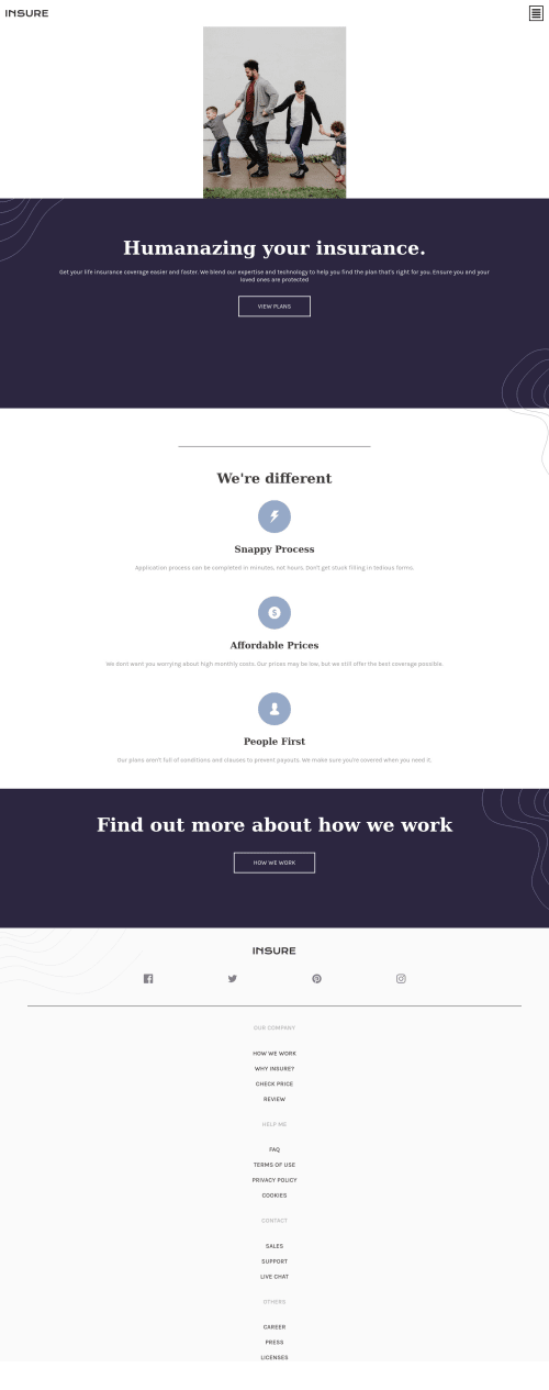
Desktop design screenshot for the Insure landing page coding challenge

This is a solution for...

  • HTML
  • CSS
  • JS
2junior
View challenge

Design comparison


SolutionDesign

Solution retrospective


I had many issues with adapting the design to desktop screens, I didn't really know what was happening and why it wasn't working.

I used a lot of flexbox in this project.

Community feedback

Roman Filenko 3,335

@rfilenko

Posted

Hey Nocolas, nice work. Some other suggestions how to improve:

  • wriite more semantic html tags (footer should be footer tag, a list of icons - also list of links, etc);
  • add desktop version using mediaqueries;
  • hover on burger menu isn't a proper way to show a menu - make it on click, just few lines in js;
  • in .insurance__text section - with z-index: -5 you can't really click a link;

Keep practicing, Roman

0
Anil Pak 155

@anlpk

Posted

Hi Nicolas,

There are several problems, *Firstly, you should not use that many br tags, (All this br tags breaking your code.) Secondly, when you start style your css follow the same flow with html and write some comment on the top such as, / Header Font Style / or / Footer Flex Box */ After for a while it is so hard to read the code and also you will spend so much time to fix it. And always start with mobile approach first and then move to different screen size it will make your life much easier.

0

Please log in to post a comment

Log in with GitHub
Discord logo

Join our Discord community

Join thousands of Frontend Mentor community members taking the challenges, sharing resources, helping each other, and chatting about all things front-end!

Join our Discord