Not Found
Not Found
Not Found
Not Found
Not Found
Not Found
Not Found
Not Found
Not Found
Not Found
Not Found
Not Found
Not Found
Not Found
Not Found
Not Found
Not Found
Not Found
Not Found
Not Found

Submitted

made with HTML&CSS

Fai• 140

@Fsanea


Design comparison


SolutionDesign

Solution retrospective


The challenge for me is with position attribute, if someone has a good reference for it please share.

Community feedback

Eleana Tyradelli• 180

@eTyradelli

Posted

Hi @Fsanea,

I'm not sure if I understand what you are trying to do, so feel free to correct me.

It seems to me that you are trying to position the main elements of the page by using position: absolute / position:relative. While it works up to a point, this way is not ideal for responsive design. CSS grid is a more intuitive and easy technique to structure the page. Position: absolute has its uses of course, but they have limits.

A couple of useful videos by Kevin Powell on position: absolute:

https://www.youtube.com/watch?v=P6UgYq3J3Qs

https://www.youtube.com/watch?v=lUaw-AA9HnA

Read about HTML layout here: https://www.w3schools.com/html/html_layout.asp Read about CSS grid here: https://learncssgrid.com/

Hope this helps! Cheers!

Marked as helpful

0

Fai• 140

@Fsanea

Posted

Thanks @eTyradelli for the resources & sure would help me

0
P
Remus D. Buhaianu• 3,145

@Miculino

Posted

Congrats on completing the challenge, @Fsanea

Your solution looks quite nice overall. Just a few suggestions based on your final solution design and code:

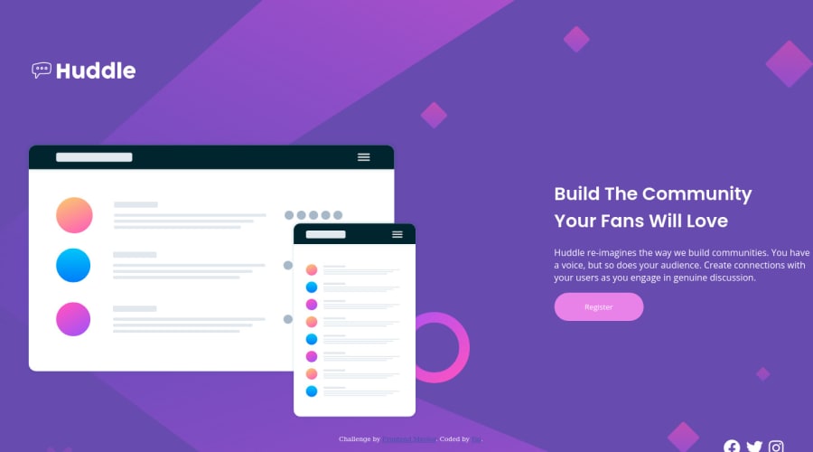
  • First of all, just to make a clear distinction, it's called property, not attribute - you have CSS properties and HTML attributes

  • There's quite a lot of vertical and horizontal scrolling that's happening - most likely because you're using the position property to create your layout

  • I highly advise against using the position property for building such layouts, especially in your case where you're using absolute and fixed values. Consider using Flexbox or CSS Grid for building your layout in a modern and efficient way

  • The "Register" button has a different color and you're also missing the box shadow on it

  • The social media icons need to have some more spacing between them and also a rounded border on each of them as shown in the original design

  • The responsive design doesn't work. Consider using media queries to rearrange the flow of the layout

https://css-tricks.com/snippets/css/complete-guide-grid/ https://css-tricks.com/snippets/css/a-guide-to-flexbox/ https://css-tricks.com/a-complete-guide-to-css-media-queries/

Hope these resources will be useful. Keep it up!

Marked as helpful

0

Fai• 140

@Fsanea

Posted

Thanks @Remus432, very helpful feedback, was needed.

1

Please log in to post a comment

Log in with GitHub
Discord logo

Join our Discord community

Join thousands of Frontend Mentor community members taking the challenges, sharing resources, helping each other, and chatting about all things front-end!

Join our Discord