Not Found
Not Found
Not Found
Not Found
Not Found
Not Found
Not Found
Not Found
Not Found
Not Found
Not Found
Not Found
Not Found
Not Found
Not Found
Not Found
Not Found
Not Found
Not Found
Not Found

Submitted

Meet Landing Page (HTML & CSS )

P
Patrick 14,325

@palgramming

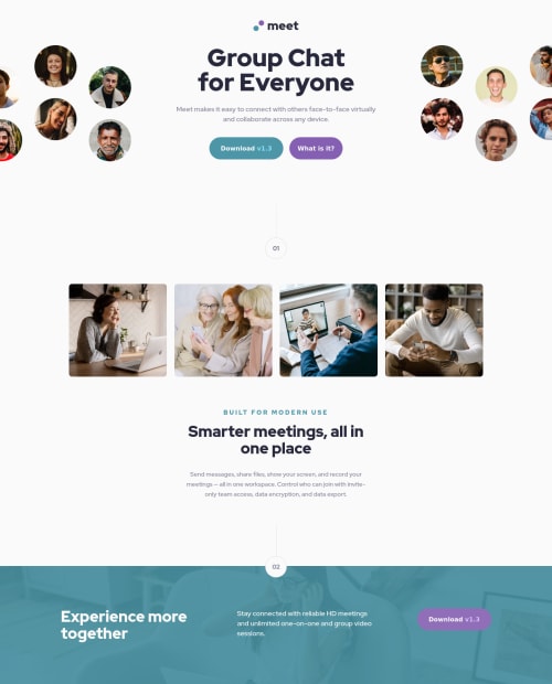
Desktop design screenshot for the Meet landing page coding challenge

This is a solution for...

  • HTML
  • CSS
1newbie
View challenge

Design comparison


SolutionDesign

Solution retrospective


Well this was a fun challenge and after thinking through it a few times I think I have it close. Getting the overlay colors correct and background positioning are still a struggle. Also if there is a better way to do the hero image and text I would like to know.

Community feedback

@AgataLiberska

Posted

Hi Patrick! I think your page looks great, well done! The overlay looks pretty spot on to me, so do the images! You could add cursor: pointer to button hover states (they should be links if you think they lead to a different page).

As for the hero section, I'm not a professional or a designer but I liek to keep in mind that many people's desktop screens are a lot wider than 1440px now. At 1440px everything looks perfect, but my screen is about 1900px I think and there's already some empty space in the middle, between the heading and the images. I haven't done this challenge so I'm not sure if you get full images, but if you do, I think I would set max-width on the header or something, so that at some point the images stop moving towards the edges of the viewport. Does that make sense?

2

P
Patrick 14,325

@palgramming

Posted

@AgataLiberska yes I realized once it gets wider than the 1440 to much white space appears. I was going to go back and try % in the background offsets but I am not sure if that will work but I will try it.

also so how wide does one normally stretch a browser window to read pages normally. I am normally about 900 to 1000 pixels wide most of the time. But I am not using 4k monitors so maybe that would change my viewpoint and experience

And I see now I have cursor pointer for the bottom button but missed it for the top two buttons I will fix that thanks.

0

@AgataLiberska

Posted

@palgramming I mean if I just browse I go full screen so that's about 1900px, and my screen is not massive by any means, but I see your point :) anyway, I guess in a team you would probably have a designer to discuss issues like that with :)

1
P
Patrick 14,325

@palgramming

Posted

@AgataLiberska OK I totally changed that hero for the desktop layout. Please tell me your thoughts if you get a chance. It should go as wide as needed I think now. The photo circles might be too close to the text as per the design but I still think it looks OK with the spacing ?? Thanks

0

Please log in to post a comment

Log in with GitHub
Discord logo

Join our Discord community

Join thousands of Frontend Mentor community members taking the challenges, sharing resources, helping each other, and chatting about all things front-end!

Join our Discord