


P
Matt Studdert• 13,611
@mattstuddert
Posted
Awesome work on this challenge, John! 🙌
1
Looking to hire developers?
@mattstuddert
Posted
Awesome work on this challenge, John! 🙌
Account Deleted
how particularly can you deal with the background color mate?
@ABCwarrior
Posted
Hi @mrtk0y, not sure i entirely understand your question.
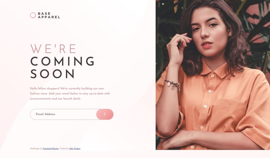
The body background is set as a background: linear-gradient();.
Then for the background image i just used an empty div with a class of bg-image and used media queries to style it only when the screen size is above 992px.
I positioned the div with CSS Grid to fill the first column, then set the background-size to cover so the background image fills the space and stretches with the browser window.
 grid-column: 1 / 2;
 grid-row: 1 / 4;
 background-image: url("../images/bg-pattern-desktop.svg");
 background-size: cover;
Hope that helps
Join thousands of Frontend Mentor community members taking the challenges, sharing resources, helping each other, and chatting about all things front-end!
Join our Discord