


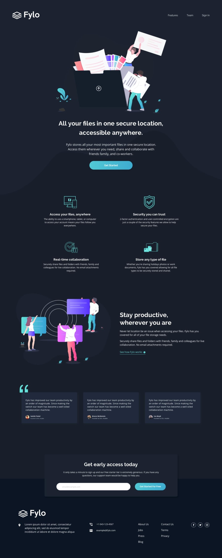


look at your .stay-productive-container and image at about 1111px it does not look centered and I thought it should be
0
KT• 390
@KtGitIt
Posted
Thanks..It's fixed now 👍🏼
0
Looking to hire developers?
Greetings All 🖐🏼,
Any feedback on anything is greatly appreciated.
Things I would like to know ,
How do I change color of arrow img on hover in see how it works link? How can I add that error message "please enter the valid email address" in cta section? In footer, I have used flexbox for desktop and when trying to shrink window, all the div/items gets bunched up rather going to next line at the bottom. I tried with flex-wrap:wrap but it doesn't work. Any idea or suggestion how to make them divs in footer go to next line in bottom using flexbox?
Best regards, KT
Join thousands of Frontend Mentor community members taking the challenges, sharing resources, helping each other, and chatting about all things front-end!
Join our Discord