


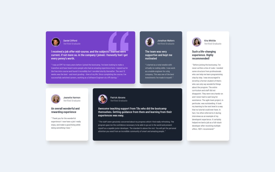

Well you have the desktop layout and the mobile one but you really need to work on the transition between both so the other screen widths have a good presentation. You might look into Grid Template Areas to help with the transitioning of your cards
@HYDROCODER
Posted
@palgramming Thank you for your feedback. I usually have trouble with deciding the breakpoints for media queries so I just used the 1440px width as a breakpoint. I didn't quite understand how grid-template areas will solve the transition problem. Do you mean I should declare more media-queries with different grid-template-areas?
@HYDROCODER
and yes making media queries with just changing the grid template area will allow you to transition your design across different browser widths with minimal code
