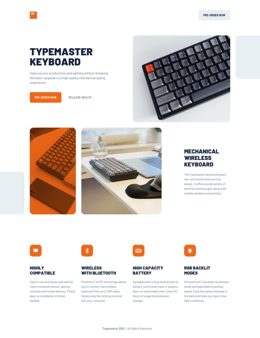
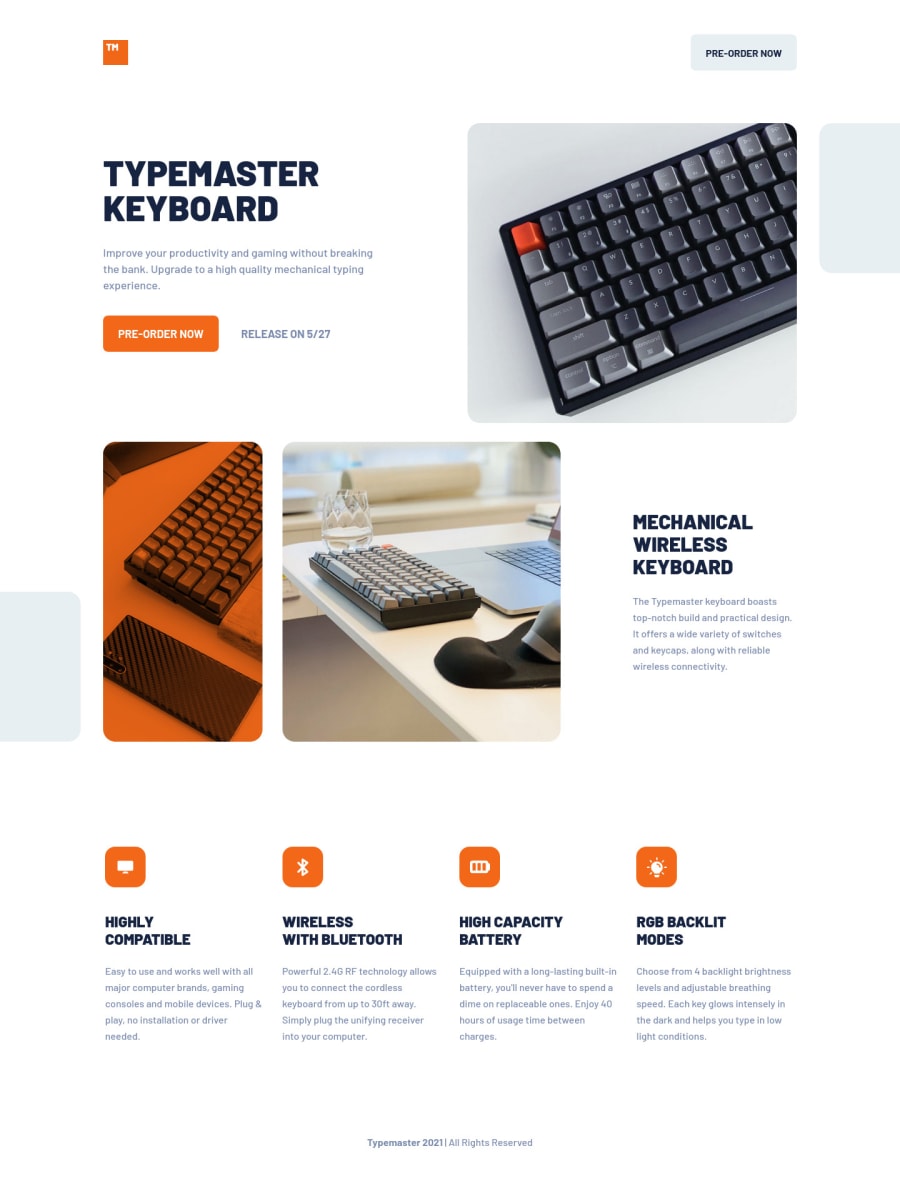
Not Found
Not Found
Not Found
Not Found
Not Found
Not Found
Not Found
Not Found
Not Found
Not Found
Not Found
Not Found
Not Found
Not Found
Not Found
Not Found
Not Found
Not Found
Not Found
Not Found

Submitted

Mobile-first solution using BEMCSS

#bem
P

@GregLyons

Desktop design screenshot for the Typemaster pre-launch landing page coding challenge

This is a solution for...

  • HTML
  • CSS
2junior
View challenge

Design comparison


SolutionDesign

Solution retrospective


Any ideas on changing the feature layout (single column, to 2x2, to single row) without using/using fewer media queries?

Community feedback

Ivan 2,630

@isprutfromua

Posted

also found some problems in css: ✅ if you use margin-inline, it is better to replace margin-top with margin-block-start

  margin-top: 24px;
  margin-inline: 24px;

✅ You Should Stop Using Pixels. They are static and aren’t truly relative to the root font-size like REM and EM units

✅ don't use tag selectors. When you add CSS directly on tags, your markup can’t change. Your style is tightly coupled to your DOM, and any change increases the risk of breaking things.


h1 {
  color: var(--blue-600);
  font-size: 48px;
  line-height: 1.0;
  font-weight: 900;
  text-transform: uppercase;
}

h2 {
  color: var(--blue-600);
  font-size: 32px;
  line-height: 36px;
  font-weight: 900;
  text-transform: uppercase;
}

h3 {

Marked as helpful

1

P

@GregLyons

Posted

@isprutfromua

I'll keep that tip for the margins in mind! That makes a lot of sense now that I think about it.

I was using pixels because I was trying to match the values in the Figma design doc exactly (up to +/- a couple pixels); I usually don't use them so much in my own work. I think in future challenges though I'll try setting up my own design system for spacing instead.

Thanks for all the feedback!

0
Ivan 2,630

@isprutfromua

Posted

@GregLyons I am glad that my help was useful to you

Cheers, peace and happy coding!

0
Ivan 2,630

@isprutfromua

Posted

Hi there. You did a good job 😎

🛠️

keep improving your programming skills

your solution looks great, however, if you want to improve it, you can follow these steps:

✅ please follow the bem methodology throughout your document

 <div class="bottom-images"> ----> should be bottom-images images
        <div class="images__orange"> 
        </div>
        <div class="images__side">
        </div>
      </div>

✅ you need to provide an alternative description for better availability, or even greet this picture with aria-hidden = true

<img src="assets/shared/icon-compatible.svg" alt="" class="feature__logo">
<img src="assets/shared/icon-light.svg" alt="" class="feature__logo">

I hope my feedback will be helpful. You can mark it as useful if so 👍

Good luck and fun coding 🤝⌨️

Marked as helpful

1

P

@GregLyons

Posted

@isprutfromua

Good catch on the class names.

I thought that using an empty alt="" tag (as opposed to omitting it) would make screen readers ignore it (https://www.w3.org/WAI/tutorials/images/decorative/), which was my intent. I put an aria-hidden="true" on each of the logos' container <div>'s though (also purely decorative), in case I'm mistaken.

0
Ivan 2,630

@isprutfromua

Posted

@GregLyons I am glad that my help was useful to you

Cheers, peace and happy coding!

0

Please log in to post a comment

Log in with GitHub
Discord logo

Join our Discord community

Join thousands of Frontend Mentor community members taking the challenges, sharing resources, helping each other, and chatting about all things front-end!

Join our Discord