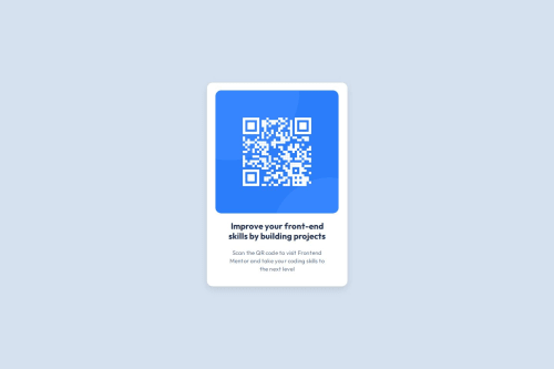
most of time I used chatgpt and other websites like W3schools

Please log in to post a comment
Log in with GitHubCommunity feedback
- @AminForouzan
Hey @youns-nibras 👋
I took a look at your code, and it's well-structured! Your use of Flexbox for centering and your clean layout are great. I just have a few suggestions to refine it and make it even more efficient:
1. Use
box-sizing: border-boxfor Consistent SizingCurrently, when you add
paddingto elements like.card, the total width increases beyond what you set. Addingbox-sizingensures padding is included in the defined width. This prevents unintended layout shifts.2. Use
remoremfor Responsive Font SizesInstead of hardcoding font sizes like
22px, switching toremoremmakes text scale better across different screen sizes:font-size: 1.375rem; /* 22px ÷ 16 */ font-size: 0.9375rem; /* 15px ÷ 16 */This helps maintain accessibility while keeping the original design proportions.
Marked as helpful - @RickLearnsToCode
Nice implementation, looks just like the challenge examples!
Join our Discord community
Join thousands of Frontend Mentor community members taking the challenges, sharing resources, helping each other, and chatting about all things front-end!
Join our Discord