Not Found
Not Found
Not Found
Not Found
Not Found
Not Found
Not Found
Not Found
Not Found
Not Found
Not Found
Not Found
Not Found
Not Found
Not Found
Not Found
Not Found
Not Found
Not Found
Not Found

Submitted

Multi-page website using HTML, SCSS & Vanilla JS
P
Jeuri Morelโ€ข 1,405

@JeuriMorel

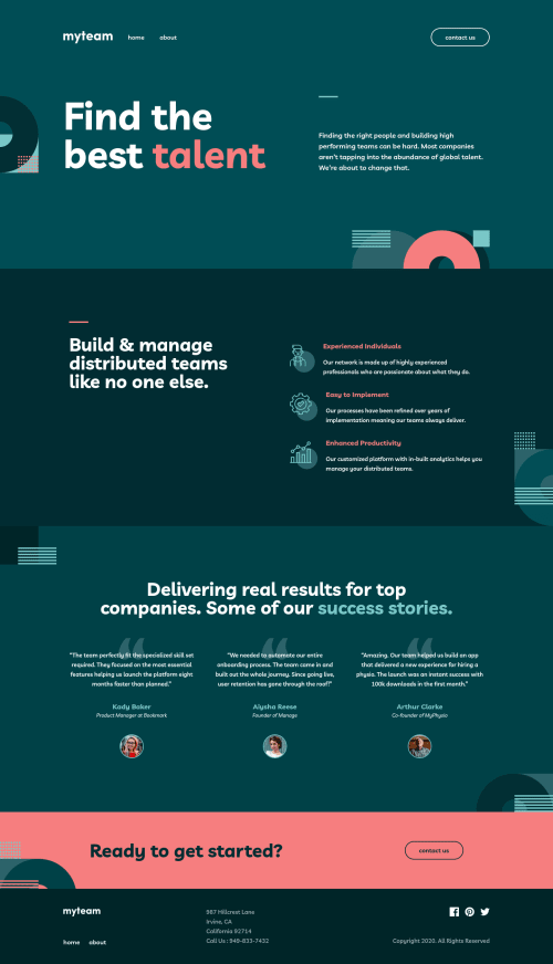
Desktop design screenshot for the myteam multi-page website coding challenge

This is a solution for...

  • HTML
  • CSS
  • JS
4advanced
View challenge

Design comparison


SolutionDesign

Solution retrospective


Hey there Frontend Mentors! Thank you for looking at my solution. Any feedback would be greatly appreciated.

One issue that I struggled with and couldn't come up with a satisfactory solution is this: It looks like if you shrink an image by using "transform: scale()", the image appears smaller, but still occupies it's original dimensions. Is there any way to have their real dimensions change dynamically? For this challenge there were many images, of varying sizes, I needed to shrink and have next to each other. I ended up having to hardcode the width for each individual image. Is there a better solution to this problem?

Community feedback

Vanza Setiaโ€ข 27,855

@vanzasetia

Posted

Hi, Jeuri! ๐Ÿ‘‹

Congratulations on finishing this challenge! ๐ŸŽ‰ Nice heading structure on the home page! ๐Ÿ‘

Regarding the images, which image that you are talking about? I don't think there are images that change sizes.

Some suggestions from me.

  • I recommend creating the "line" above some text with a pseudo-element.
  • There is already alternative text for the logo. There's no need to enhance that with aria-label.
  • Alternative text for the logo should not contain the word "logo". The semantic meaning of the img element is good enough to tell users that it is an image.
  • Use interactive element for something that has interactivity. In this case, the hamburger menu button should be a button element. Then, make the button listens to the click event (not the icon).
  • There should be only one HTML markup for the mobile and desktop navigation. I recommend reading my README (#accessible-menu-component section). I wrote about the HTML markup and some ARIA attributes to improve the experience for the users of assistive technology.
  • For images that are used only as decorations (they do not give users any information and serve only an aesthetic purpose), the alt tag should still exist but should be left empty: alt="". This will tell the screen reader to simply skip over the image.
  • I recommend taking a look at "Quick tip: Using alt text properly - The A11Y Project".
  • For the social media links, if the social media icons have alternative text, then it's already becoming the label for the link. So, remove the aria-label from all social media icons.
  • On the about page, I recommend trying to look at the page without styling (just HTML). There are two h3 with the same text content. I would think that the second name of the director as a paragraph instead.
  • Use button element for the card__btn.
  • In your CSS, I noticed this selector .about .directors .container .grid .card__container.flipped .card__btn img which would much be as .card__btn img . I recommend only nesting when you want to style pseudo-elements, pseudo-classes (:hover, :focus, etc), and @media queries. It's a good practice to keep the CSS specificity as low and flat as possible. High specificity will make your stylesheet hard to maintain.
  • I recommend reading "5 Handy Sass Code Snippets" article. In that article, you will find some useful @mixin to help you write Sass.
  • Input element must have an accessible name. You can use aria-label to label each input.
  • I recommend reading "How To Create Accessible Form with Boring Design?", which will give you a guide to creating accessible form validation with aria-live and aria-describedby (and much more!)

I have three recommended videos. The first one tells how hard HTML is (HTML is not easy). The other two talk about modern CSS techniques and approaches.

I hope this helps! Happy coding!

Marked as helpful

1

P
Jeuri Morelโ€ข 1,405

@JeuriMorel

Posted

@vanzasetia Thank you so much for the feedback, it helps a ton. I've made some progress since I submitted this solution, but your comments are helpful nonetheless. I've bookmarked everything you've linked to and will hopefully get through them sometime in the next week. Thank you so much for taking the time to review my code and comment.

The images I was referring to were the company names in the about page.

Thanks again and have a great day!

0
Vanza Setiaโ€ข 27,855

@vanzasetia

Posted

@JeuriMorel

You are welcome! ๐Ÿ‘

Okay! I made the parent of those company logos a flex container. Then, I used max-width and flex properties to control the width of those images. I think flexbox is a good solution for this problem.

Have a nice day too! ๐Ÿ™‚

Marked as helpful

1
P
Jeuri Morelโ€ข 1,405

@JeuriMorel

Posted

@vanzasetia That makes sense! Flexbox is a great tool for these kinds of issues.

1

Please log in to post a comment

Log in with GitHub
Discord logo

Join our Discord community

Join thousands of Frontend Mentor community members taking the challenges, sharing resources, helping each other, and chatting about all things front-end!

Join our Discord