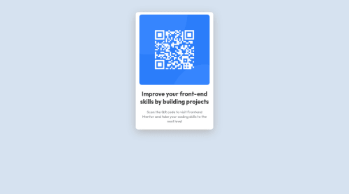
My first QR code challenge using HTML and CSS

Solution retrospective
I'm done with the challenge so far and I don't know how to display the favicon. I got lots of difficulties on GitHub lol because this is my first time using it.
If there are things you see that need tweaking, please let me know.
If the codes are understandable and clean? is the media query rule I used correct?
please give me your reviews on my code if you have time.
Thank you to all!!
Have a great day!
Please log in to post a comment
Log in with GitHubCommunity feedback
- @andreasremdt
Hey, congrats on solving the challenge :)
I checked your favicon, it's is used and displayed correctly, so no worries there.
In my opinion, your code is clean and understandable. One suggestion I have is to use the
mainelement for the container instead of adiv. This gives you accessibility benefits because every page is supposed to have one main landmark, here it's the card itself.The media query is technically correct, but I don't think that you need one here. Instead, what you can do is setting
max-width: 100%on the image itself, which will make it responsive. You can even remove thewidth: 290px. This way, the image grows and shrinks with the browser without the need to write any media queries. This is also a great way of making videos and other media responsive in CSS. Hope it helps :)Marked as helpful - @ChamuMutezva
Greetings Cathleys,
Indeed , well done on your first challenge. Some of my points have been raised already but here is what i think:
- the image is not responsive in a way, @andreasremdt has addressed it above, it is a good idea to reset images to
max-width: 100%- that will make sure that the image can fit fully without overlapping when the container is smaller or the fixed width that had been applied with css. You have currently set the width to 290px, check the site using dev tools or on a mobile that has a screen size of less than 375px , you will notice that the image is overlapping the container. But with a max-width of 100%, the image will be contained in it's container. - for font sizes , i would suggest to use rems instead of px , you can read more on this px vs rem
Happy coding
Marked as helpful - the image is not responsive in a way, @andreasremdt has addressed it above, it is a good idea to reset images to
- @madkn1311
Hello Cathleys,
Good job on your first challenge..!!
What I noticed in the CSS for the container is that you have used both width and max-width. Since max-width overrides width so its better to use just max-width.
All the best for the next challenge. :)


Join our Discord community
Join thousands of Frontend Mentor community members taking the challenges, sharing resources, helping each other, and chatting about all things front-end!
Join our Discord