Not Found
Not Found
Not Found
Not Found
Not Found
Not Found
Not Found
Not Found
Not Found
Not Found
Not Found
Not Found
Not Found
Not Found
Not Found
Not Found
Not Found
Not Found
Not Found
Not Found

Submitted

My qr-code

Nasir Muminβ€’ 70

@Nasir222222

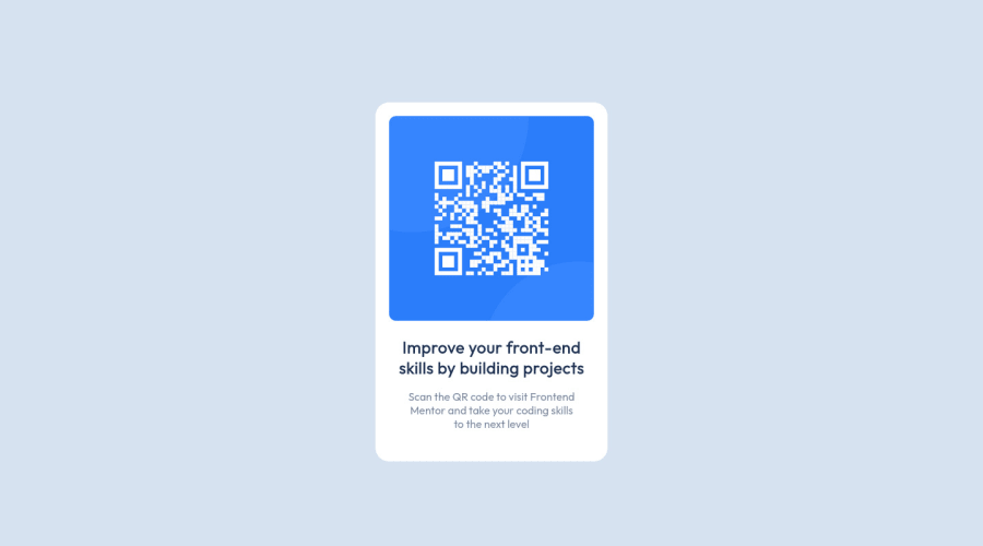
Desktop design screenshot for the QR code component coding challenge

This is a solution for...

  • HTML
  • CSS
1newbie
View challenge

Design comparison


SolutionDesign

Community feedback

Lucas πŸ‘Ύβ€’ 104,580

@correlucas

Posted

πŸ‘ΎHi Nasir Mumin, congratulations on your solution!πŸ‘‹ Welcome to the Frontend Mentor Coding Community!

Great solution and a great start! From what I saw you’re on the right track. I’ve few suggestions for you that you can consider adding to your code:

1.Add <main> instead of <div> to wrap the card container. This way you show that this is the main block of content and also replace the div with a semantic tag.

2.Replace the <h2> containing the main title with <h1> note that this title is the main heading for this page and every page needs one h1 to show which is the most important heading. Use the sequence h1 h2 h3 h4 h5 to show the hierarchy of your titles in the level of importance, never jump a level.

3.Add the website favicon inserting the svg image inside the <head>. <link rel="icon" type="image/x-icon" href="./images/favicon-32x32.png">

4.Use units as rem or em instead of px to improve your performance by resizing fonts between different screens and devices.

To save your time you can code your whole page using px and then in the end use a VsCode plugin called px to rem here's the link β†’ https://marketplace.visualstudio.com/items?itemName=sainoba.px-to-rem to do the automatic conversion or use this website https://pixelsconverter.com/px-to-rem

Here's my solution for this challenge if you wants to see how I build it: https://www.frontendmentor.io/solutions/qr-code-component-vanilla-cs-js-darklight-mode-nS2aOYYsJR

✌️ I hope this helps you and happy coding!

1

Nasir Muminβ€’ 70

@Nasir222222

Posted

@correlucas thanks bro, am just a beginner

0

@VCarames

Posted

Hey, some suggestions to improve you code:

  • To properly center your card to the page, add the following to your Body Element:
body {
  min-height: 100vh;
  display: flex;
  justify-content: center;
  align-items: center;
}
  • Never add a width / max-width to your Body Element. All you are doing is creating a headaches for you and users who look at your content.

  • The Alt Tag description for the QR image needs to be improved upon. Its needs to tell screenreader users what it is and where it will take them to when they scan it.

  • For headings, you always start with <h1> Heading. If this in a larger site with more cards, then the <h2> or <h3> Heading might be the better option.

  • Change the width in the .qr to max-width to make it responsive.

  • Change the width in the img to width: 100% to make it responsive.

  • Remove the width from the h2. Your making your card unresponsive with this.

Happy Coding!

0

Please log in to post a comment

Log in with GitHub
Discord logo

Join our Discord community

Join thousands of Frontend Mentor community members taking the challenges, sharing resources, helping each other, and chatting about all things front-end!

Join our Discord