


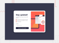
Design comparison


Solution retrospective
This is a solution to the Newsletter sign-up form with success message challenge on Frontend Mentor. Frontend Mentor challenges help you improve your coding skills by building realistic projects.
Users should be able to:
- Add their email and submit the form
- See a success message with their email after successfully submitting the form
- See form validation messages if:
- The field is left empty
- The email address is not formatted correctly
- View the optimal layout for the interface depending on their device's screen size
- See hover and focus states for all interactive elements on the page
I began with breaking down the design into possible HTML structures and deciding how they might interact with each other. I have created a modal of similar style so, I opted for the structure I was most familiar with. Which was to create a hole container modal and then two sub div halves that would each take 50% of the flex-box. Then style each half as if it were it's own piece.
Managing the negative space was a bit difficult and tedious, but I appreciated the challenge.
- Semantic HTML5 markup
- CSS custom properties
- Flexbox
This project turned out to be more of a challenge than I expected. Mostly in terms of styling. That is where my skills lack the most! However, I am proud of the turnout for the CSS here:
@media (max-width: 600px) {
    section {
        flex-direction: column-reverse;
        height: 100vh;
        width: 60vw;
        border-radius: 0;
        padding: 0;
        margin: 0;
        justify-content: start;
    }
    ...
}
And all the following styling. Using @media was a bit new to me, but I enjoyed learning something new.
- Web Dev - This helped me working with the
transitionproperty in the CSS. For some reason, usingtransitionalone was not creating the results I wanted. For instance:transition: 300ms ease-in-out smoothwould not work as a smooth eased transition. So, I ended up working with individual properties.
- Website - Denise Zitting
- Frontend Mentor - @DeniseZitting
Community feedback
Please log in to post a comment
Log in with GitHub
Join our Discord community
Join thousands of Frontend Mentor community members taking the challenges, sharing resources, helping each other, and chatting about all things front-end!
Join our Discord