Submitted over 3 years agoA solution to the NFT preview card component challenge
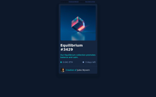
NFT preview card component
accessibility, bem, fetch, jquery, itcss

@ayushbhargava22
Code
Please log in to post a comment
Log in with GitHubCommunity feedback
- @adityas24
Hey Ayush good job.
I saw that you are using margins to give spaces around the elements inside the card. For example in
<div class="nft-img"></div>and<div class="owner"></div>.Do not use margins for this purpose. Use padding instead. Margins are used when we want to give space between two adjacent elements. But to give space around the element always use padding.
All the best 🙂👍
Marked as helpful - @RioCantre
Hello there! Good job in this project. You did well in implementing the design and I would like to suggest the following for you...
- Add the hover state for the fonts, for example...
.nft-name:hover { color: hsl(178, 100%, 50%); cursor: pointer; } .name:hover { color: hsl(178, 100%, 50%); cursor: pointer; }- Adjust the top position of the
containerinto 50% and add a padding ofpadding: 0.5rem; - Adjust the size in the
.nft-nameinto 22px and add a padding ofpadding: 0.5rem 0; - Change the color value in the
.nft-sub-infointocolor: hsl(215, 51%, 70%);and addfont-size: 15px;andpadding: 1rem 0; - Change the color value of
nft-priceintocolor: hsl(178, 100%, 50%); - Inside the
.owner pchange the color withcolor: hsl(215, 51%, 70%); - Wrap the content
containerwithmaintag andattributionwithfootertag for readability
Hope this helps and Keep going!
Marked as helpful


Join our Discord community
Join thousands of Frontend Mentor community members taking the challenges, sharing resources, helping each other, and chatting about all things front-end!
Join our Discord