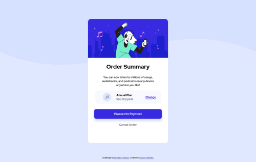
Order summary component

Solution retrospective
Hi,
This is my first challenge that it took me a while to build and get to finish.
I'm a beginner and I don't have much knowledge about good practices. If you can evaluate my code and give you some initial good practice tips I would be very grateful.
I also had difficulty in the font-weight of the title that didn't match the model despite having bold. How can I fix this?
Thank you very much!
Please log in to post a comment
Log in with GitHubCommunity feedback
- @remusbuhaianu
Good job on completing your first challenge, Herson!
I know it can be really intimidating at first, but with each challenge you complete, you become more confident in your coding skills. So, well done on completing this Frontend Mentor challenge!
I had a look at your live solution and I also looked through your code and I have a few suggestions / observations I'd like to share with you.
In no particular order, here they are:
-
As @Drougnov pointed out, when you imported the font from Google Font, you only selected the 300 weight and that's why you can't use the bold weight in your design. Add the 600 or 700 weight to your import and it should work just fine after that.
-
A best practice for CSS is to reset the margin and padding of all elements using the * selector. You can also add the border-box property which will make sure that the padding and margin are added to the element's total width and height. You can see an example here: https://stackoverflow.com/questions/46923610/css-resetting-margin-and-padding/46923672
-
You might want to look into BEM methodology for a neat way to structure your HTML classes. If not, just try to keep in mind that your code should read like prose. Always use classes that can be understood by other developers, if they were to read through your code.
-
Instead of using absolute values like px, try to implement relative units like rem. I saw you've used vh on the body element, but there was no reason to set a 100vh height on the body in that case.
-
As @skyv26 pointed out, you don't have any media queries which means your project won't be responsive. You need media queries to make your project look good and structured no matter the device you use to see the website.
All in all, you've done a great job for your first project. I also suggest you have a look through https://www.frontendmentor.io/resources and use those resources to improve your skills as a developer.
Keep up the good work and looking forward to seeing more of your projects here on Frontend Mentor!
Marked as helpful -
- @Drougnov
Hello, @Hersonmei Good job with the layout.
I think you selected only 'font-weight=300' from the google font. I'm not sure though. You may check that out.
Marked as helpful - @skyv26
Hi! Herson, I just checked your work. You made it, it a really good initiate towards your progress.
I noticed some issues.
-
You Annual plan font size is too bigger than normal, either change your price h2 size or instead of h2 you can simply use p tag and adjust size with font-size property.
-
You have not implemented media queries. Always keep in mind that more than half of the world try to open any website on their phone first. If your mobile response is not good then nobody will open that website on their laptop too.
I hope you understand. Soon I will see your next solution.
Good Luck
Marked as helpful -
- @KaptainCS3
Good job bro Concerning the bold issues you had with your code, also go through the sample style guide it help me alot. I go suck figuring out color just by look at the design, but when I discovered the style guide it became more easier.
Marked as helpful - @renatoknot
@Hersonmei Great job! The only thing I noticed was missing was the button hovers. Detailed colors to use on Hover are in Design folder, file "active-states.jpg"


Join our Discord community
Join thousands of Frontend Mentor community members taking the challenges, sharing resources, helping each other, and chatting about all things front-end!
Join our Discord