Skip to content
  • Unlock Pro
  • Log in with GitHub
Profile
OverviewSolutions
10
Comments
16

Herson

@HersonmeiBrazil220 points

A beginning front-end student, willing to learn more about web development and contribute to the community.

Latest solutions

  • FAQ card


    Herson•220
    Submitted over 3 years ago

    1 comment
  • Base Apparel coming soon page


    Herson•220
    Submitted over 3 years ago

    4 comments
  • Four card using Grid


    Herson•220
    Submitted over 3 years ago

    1 comment
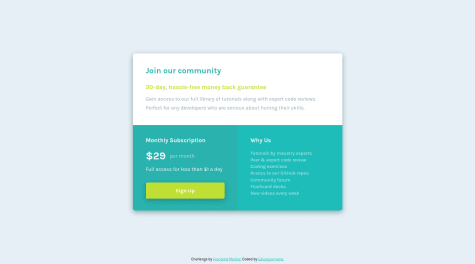
  • Single price grid


    Herson•220
    Submitted over 3 years ago

    1 comment
  • Social Proof Section using Flexbox and Grid


    Herson•220
    Submitted over 3 years ago

    1 comment
  • Huddle landing page using CSS GRID


    Herson•220
    Submitted over 3 years ago

    1 comment
View more solutions

Latest comments

  • Nguyen Nguyen•340
    @jesuisbienbien
    Submitted over 3 years ago

    3-column-preview card component (use flexbox, how to use grid?)

    3
    Herson•220
    @Hersonmei
    Posted over 3 years ago

    2 - To center your main on the page, you can apply the flex display in the body.

    Your body will look like this:

    body {
      font-family: "Lexend Deca", sans-serif;
      font-size: 1rem;
      background-color: var(--very-light-gray);
      height: 100vh;
      width: 100vw;
      display: flex;
      flex-direction: column;
      justify-content: center;
    }
    
    Marked as helpful
  • Jurek Tomasello•20
    @jurektomasello
    Submitted over 3 years ago

    Responsive coming soon page using Flexbox

    2
    Herson•220
    @Hersonmei
    Posted over 3 years ago

    Hi Jurek!

    See how is the responsiveness of my solution, see if this is what you want to do:

    https://hersonmei.github.io/Base-Apparel-coming-soon-page/

    If so, I can see how to help you, but I remember that it took me a while to solve this too.

  • Caio de Alcantara Santos•250
    @caio-alcantara
    Submitted over 3 years ago

    Responsive 3 Column Preview Card using Flexbox/SCSS and Mobile-First

    #sass/scss
    5
    Herson•220
    @Hersonmei
    Posted over 3 years ago

    Hi Caio!

    Test it out and see if it works.

    Add this color to your hover:

    .card a:hover {
      background-color: transparent;
      -webkit-transition-duration: .1s;
      transition-duration: .1s;
      color: hsla(0, 0%, 100%, 0.75);
    }
    

    I think it's a question of specificity, it would be good to see that because I won't be able to explain it very well. But I managed to solve it by deleting all its id and transforming it into classes.

    In your HTML code it will look like this:

    <div class="card sedans" >
    ...
    </div>
    
    <div class="card suvs">
    ...
    </div>
    

    And in your CSS code it will look like this:

    .sedans {
       ...
    }
    .sedans a {
      ...
    }
    .suvs {
       ...
    }
    .suvs a {
       ...
    }
    .luxury {
    ...
    }
    .luxury a {
       ...
    }
    

    Only with these changes has it started to work here. I recommend trying to find out the more detailed explanation of this, but I believe it could be greater ID specificity.

    Good studies and keep sending new projects!

  • Raymundo Alva•40
    @rayalva407
    Submitted over 3 years ago

    Mobile-First Workflow NFT Preview Card Component

    2
    Herson•220
    @Hersonmei
    Posted over 3 years ago

    Hi @rayalva407!

    • Try adding this border and this border-radius in your code to see if it works:
    #pfp {
          width: 12%;
          padding-top: 5px;
          float: left;
          border: solid 1px hsl(0, 0%, 100%);
          border-radius: 50%;
        }
    
    • Instead of using so many id, use classes, because the id you can only use once and the classes you can repeat in different elements.

    Good studies and keep doing new projects!

  • Abdellah el aajjouri•190
    @abdellahelaajjouri
    Submitted over 3 years ago

    Css , Flexbox , mediaquery

    1
    Herson•220
    @Hersonmei
    Posted over 3 years ago

    Hi @abdellahelaajjouri,

    If you still don't know it, I recommend that you study the CSS Grid, it will help a lot in those exercises that need to work with rows and columns at the same time.

    The ideal is also that you don't use too many IDs, you could put a1,a2.. as classes.

    I made some changes to your file if you want to simulate it to see how it would look closer to resolution:

    1 - I delete the div <div class="main-article"> , with that all the items were inside the main.

    2 - I changed all ids a1, a2.. to classes i your HTML file.

    3 - I changed the ids in your css file to class (from # to .).

    .a1{
        border-top: 4px solid var(--Cyan);
    }
    ...
    

    4 - I didn't understand why you put two media queries, so I left only the first one with the code below:

        /* For desktop: */
        header h4 , header h2 {
            font-size: 5vh;
        }
        main {
            display: grid;
            grid-template-columns: repeat(3, 1fr);
            grid-template-rows: auto repeat(2, 1fr);
            justify-items: center;
        }
    
        header{
            grid-column: 1 / 4;
            grid-row: 1;
        }
    
        .to 1{
            grid-column: 1;
            grid-row: 2 / 4;
            align-self: center;
        }
    
        .a2{
            grid-column: 2;
            grid-row: 2;
        }
    
        .a3{
            grid-column: 2;
            grid-row: 3;
        }
    
        .a4{
            grid-column: 3;
            grid-row: 2 / 4;
            align-self: center;
        }
      
    } 
    

    Not that this is the final answer, but it's a little closer to ideal, I'm studying CSS Grid more and it has helped me a lot, I hope it helps you too!

    Good studies and keep sending new projects!

    Marked as helpful
  • Ediongsenyene Joseph I.•1,695
    @IEdiong
    Submitted over 3 years ago

    Responsive Single Price Grid Using Flexbox

    #accessibility
    2
    Herson•220
    @Hersonmei
    Posted over 3 years ago

    Hi @IEdiong!

    Nice! I liked the hover effect.

    Glad to know that (per month) you used opacity, I thought it was a specific color and I couldn't replicate it in my project.

View more comments
Frontend Mentor logo

Stay up to datewith new challenges, featured solutions, selected articles, and our latest news

Frontend Mentor

  • Unlock Pro
  • Contact us
  • FAQs
  • Become a partner

Explore

  • Learning paths
  • Challenges
  • Solutions
  • Articles

Community

  • Discord
  • Guidelines

For companies

  • Hire developers
  • Train developers
© Frontend Mentor 2019 - 2025
  • Terms
  • Cookie Policy
  • Privacy Policy
  • License

Oops! 😬

You need to be logged in before you can do that.

Log in with GitHub

Beta Member

This badge is a shoutout to the early members of our community. They've been around since the early days, putting up with (and reporting!) bugs and adjusting to big UX overhauls!

Oops! 😬

You need to be logged in before you can do that.

Log in with GitHub

Oops! 😬

You need to be logged in before you can do that.

Log in with GitHub

Oops! 😬

You need to be logged in before you can do that.

Log in with GitHub

Oops! 😬

You need to be logged in before you can do that.

Log in with GitHub

Oops! 😬

You need to be logged in before you can do that.

Log in with GitHub

Oops! 😬

You need to be logged in before you can do that.

Log in with GitHub

Oops! 😬

You need to be logged in before you can do that.

Log in with GitHub

Oops! 😬

You need to be logged in before you can do that.

Log in with GitHub

Oops! 😬

You need to be logged in before you can do that.

Log in with GitHub

Oops! 😬

You need to be logged in before you can do that.

Log in with GitHub

Oops! 😬

You need to be logged in before you can do that.

Log in with GitHub

Oops! 😬

You need to be logged in before you can do that.

Log in with GitHub

Oops! 😬

You need to be logged in before you can do that.

Log in with GitHub

Oops! 😬

You need to be logged in before you can do that.

Log in with GitHub

Oops! 😬

You need to be logged in before you can do that.

Log in with GitHub

Oops! 😬

You need to be logged in before you can do that.

Log in with GitHub

Oops! 😬

You need to be logged in before you can do that.

Log in with GitHub

Oops! 😬

You need to be logged in before you can do that.

Log in with GitHub

Oops! 😬

You need to be logged in before you can do that.

Log in with GitHub

Oops! 😬

You need to be logged in before you can do that.

Log in with GitHub

Oops! 😬

You need to be logged in before you can do that.

Log in with GitHub

Oops! 😬

You need to be logged in before you can do that.

Log in with GitHub

Oops! 😬

You need to be logged in before you can do that.

Log in with GitHub

Oops! 😬

You need to be logged in before you can do that.

Log in with GitHub

Oops! 😬

You need to be logged in before you can do that.

Log in with GitHub

Oops! 😬

You need to be logged in before you can do that.

Log in with GitHub

Oops! 😬

You need to be logged in before you can do that.

Log in with GitHub

Oops! 😬

You need to be logged in before you can do that.

Log in with GitHub

Oops! 😬

You need to be logged in before you can do that.

Log in with GitHub

Oops! 😬

You need to be logged in before you can do that.

Log in with GitHub