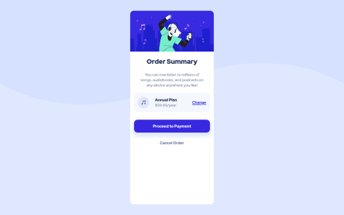
Order summary component

Solution retrospective
Would definitely love to hear feedback about the button's shadow & ways to improve it, and the design overall. Thanks in advance!
Please log in to post a comment
Log in with GitHubCommunity feedback
- @AdrianoEscarabote
Great job on this challenge! your report has some problems:
Your card-container div got a little stretched and it wasn't very similar to the example, you could adjust its height so that it fits with the content, you could use a fixed height or some other responsive one that when the layout goes down it it is decreasing too, but congratulations the rest was very good.
Hope it helps:)...don't forget to mark it as helpful 👍
Marked as helpful - @LuizaUszacki
Hi, @mmetwally0.
Instead of
main .card-container .summary-box .payment a:hovertrymain .card-container .summary-box .payment > a:hover. It will change the color just of the payment'sadirect child. So, you won't have your payment-btn'sachanging its text color.You could also add a
transitionto make the change smoother. - @devmor-j
Hey this is nice 🎉
One small suggestion I can make is to remove
height: 90vhfromcard-containerclass and instead addpadding-bottom: 2rem.Everything else is working as expected, keep going and have fun 😃 🌹


Join our Discord community
Join thousands of Frontend Mentor community members taking the challenges, sharing resources, helping each other, and chatting about all things front-end!
Join our Discord