Skip to content
  • Unlock Pro
  • Log in with GitHub
Profile
OverviewSolutions
11
Comments
27

Devmor

@devmor-j470 points

Hey, I love to develop minimal and optimized code, avoiding unnecessary frameworks only if adds real value to project.

I’m currently learning...

Astro, Vite plugin ssr

Latest solutions

  • Fylo landing page using Tailwind, fluid typography and toast message

    #tailwind-css#vite

    Devmor•470
    Submitted almost 3 years ago

    0 comments
  • Fylo 2 column layout + custom scrollbar + email validation

    #tailwind-css

    Devmor•470
    Submitted almost 3 years ago

    0 comments
  • Time Tracking Dashboard - [Vue 3 + TS + SASS] Vite Workflow

    #sass/scss#typescript#vue#vite

    Devmor•470
    Submitted about 3 years ago

    0 comments
  • Bootstrap 5 + SASS on [Intro section with dropdown navigation] project

    #bootstrap#sass/scss#vite

    Devmor•470
    Submitted about 3 years ago

    0 comments
  • Advice Generator Using Vue, Respecting Reduced-Motion

    #accessibility#vite#vue#fetch

    Devmor•470
    Submitted about 3 years ago

    1 comment
  • Advice Generator App - Vue simple workflow

    #vue

    Devmor•470
    Submitted about 3 years ago

    0 comments
View more solutions

Latest comments

  • Satyam Jha•400
    @satyammjha
    Submitted almost 3 years ago

    intro-section-frontend

    #accessibility
    1
    Devmor•470
    @devmor-j
    Posted almost 3 years ago

    Hey this is a great solution 🎉

    One quick tip:

    I think the hero text would be easier to read if you increase line-height a bit. I tried line-height: 1.4; and it already looks good.

    Hope this helps and cheers 😀

    Marked as helpful
  • Daniela Darnea•180
    @mdanieladla
    Submitted almost 3 years ago

    Reponsive advice generator app with React and Sass

    #react#sass/scss
    2
    Devmor•470
    @devmor-j
    Posted almost 3 years ago

    Great this is almost identical well done 🎉

    One important tip:

    Right now this app might not fetch new advice on Firefox browsers because they rely on cache and we have to enforce the browser to call API service on each user request.

    This can be easily done by adding {cache: 'no-store'} option to our fetch service like so:

    inside ==> advice-generator/src/services/api.js

    const callToApi = () => {
      return fetch('https://api.adviceslip.com/advice', { cache: 'no-store' })
        .then((response) => response.json())
         .........
    

    Hope this is helpful and have a nice time coding 🤩

    Marked as helpful
  • Rawley•160
    @EbotRawley
    Submitted almost 3 years ago

    Responsive Stats Preview Card with both CSS Flexbox and Grid

    1
    Devmor•470
    @devmor-j
    Posted almost 3 years ago

    Hey this is great ✨

    You did it, it looks good. Here are some of my suggestions and answer to your question:

    1️⃣ Even though the sizes are fine on 100% zoom (initial zoom on most browsers), the ux is not very well when user zooms in/out. I went through your code and I suggest get rid of absolute position on .cont class and overall it's not a best practice to use it anyway (unless we have to). In this case we can achive centering simply with these refactoring:

    First remove these rules from .cont class:

    .cont {
        top: 50%;
        left: 50%;
        width: 75%;
        height: 60%;
        overflow: hidden;
        position: absolute;
        transform: translate(-50%, -50%);
    }
    

    Then insert these properties to .cont class:

    .cont {
      /* adjust 56rem size (this is just a good starting point) */
      width: min(100%, 56rem);
      margin: auto;
    }
    

    Finally add these rules to your body element to center it's content:

    body {
      display: flex;
      min-height: 100vh;
      margin: 0;
    }
    

    Now you have a great zooming capability and did not mess with the positioning (which means easier styles to maintain).

    2️⃣ Your image overlay looks ok but if you want to be percise then try to use mix-blend-mode: multiply then adjust opacity around 0.8.

    3️⃣when you've applied these refactorings, don't forget about @media queries and make sure their fine too.

    I liked your solution and keep going ✌ 🦄

    Marked as helpful
  • Mohamed Metwally•50
    @mmetwally0
    Submitted almost 3 years ago

    Order summary component

    3
    Devmor•470
    @devmor-j
    Posted almost 3 years ago

    Hey this is nice 🎉

    One small suggestion I can make is to remove height: 90vh from card-container class and instead add padding-bottom: 2rem.

    Everything else is working as expected, keep going and have fun 😃 🌹

  • alisher-kadraliev•30
    @alisher-kadraliev
    Submitted almost 3 years ago

    Html/Css/Js use gulp

    #gulp
    1
    Devmor•470
    @devmor-j
    Posted almost 3 years ago

    Well done🏆

    One thing I like to suggest is to shrink the hero image a bit. To do so I tried this inline css and it worked:

    /* on second .hero__item where the image resides */
    .hero__image {
      width: min(100%, 24rem);
    }
    

    Also decreasing padding on .section__hero would help too. In my opinion hero sections should not have a scrollbar (of course on a real website this is not a concern but here it will look much better).

    Overall I enjoyed your well written SCSS and you did great, keep rocking ✨🌹

    Marked as helpful
  • elahe•50
    @elahemirzaee
    Submitted almost 3 years ago

    FAQ-Accordion-Card

    1
    Devmor•470
    @devmor-j
    Posted almost 3 years ago

    Great 🏆🎇 The functionality is there and it works. But there are some minor styling issues 🎨. If you like CSS refactoring (which I highly recommend), These are my suggestions:

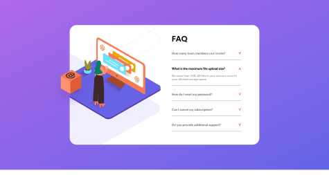
    1️⃣ main content should fill the whole screen space (because it has a gradient):

    /* add these properties to these rules */
    main {
        ...
        min-height: 100vh;
        align-content: center;
        padding: 2rem;
        ...
    }
    
    .main {
        ...
        /* 50rem is the total width of the faq card, adjust if not happy with it */
        width: min(100%, 50rem);
        ...
    }
    

    📝 remove these extra height properties:

    html {
        height: 100%;
    }
    
    body {
        height: 100%;
    }
    

    2️⃣ in mobile view there is not enough space to show decorative image and content side by side. so either remove it for screens below '40rem' or stack them on top of each other (I personally have removed it):

    @media (max-width: 40rem) {
        .image {
            display: none;
        }
    
        .faqs {
            width: 100%;
        }
    }
    

    3️⃣ class of .faqs has a complex padding and specially on mobile view causes a big empty gap next to arrows, so maybe '2rem' or '3rem' should suffice:

    .faqs {
        ...
        /* adjust to your own preference */
        padding: 2rem; 
        ...
    }
    

    4️⃣ your image trick is awesome and I liked it 🥰

    5️⃣ class of .arrow could improve a lot, here is my version:

    .arrow {
        transition: transform 0.3s ease-in-out;
        align-self: center;
        object-fit: contain;
        width: 0.75rem;
        margin-left: 0.75rem;
        user-select: none;
        pointer-events: none;
    }
    

    ❗ and to update your accessibility report (saying about 'role=main', you have to manually generate a new one (there is a red button to do so next yo your report). Same thing goes for screenshots.

    Have a nice time and cheers 😄🎉

    Marked as helpful
View more comments
Frontend Mentor logo

Stay up to datewith new challenges, featured solutions, selected articles, and our latest news

Frontend Mentor

  • Unlock Pro
  • Contact us
  • FAQs
  • Become a partner

Explore

  • Learning paths
  • Challenges
  • Solutions
  • Articles

Community

  • Discord
  • Guidelines

For companies

  • Hire developers
  • Train developers
© Frontend Mentor 2019 - 2025
  • Terms
  • Cookie Policy
  • Privacy Policy
  • License

Oops! 😬

You need to be logged in before you can do that.

Log in with GitHub

Oops! 😬

You need to be logged in before you can do that.

Log in with GitHub

Oops! 😬

You need to be logged in before you can do that.

Log in with GitHub

Oops! 😬

You need to be logged in before you can do that.

Log in with GitHub

Oops! 😬

You need to be logged in before you can do that.

Log in with GitHub

Oops! 😬

You need to be logged in before you can do that.

Log in with GitHub

Oops! 😬

You need to be logged in before you can do that.

Log in with GitHub

Oops! 😬

You need to be logged in before you can do that.

Log in with GitHub

Oops! 😬

You need to be logged in before you can do that.

Log in with GitHub

Oops! 😬

You need to be logged in before you can do that.

Log in with GitHub

Oops! 😬

You need to be logged in before you can do that.

Log in with GitHub

Oops! 😬

You need to be logged in before you can do that.

Log in with GitHub

Oops! 😬

You need to be logged in before you can do that.

Log in with GitHub

Oops! 😬

You need to be logged in before you can do that.

Log in with GitHub

Oops! 😬

You need to be logged in before you can do that.

Log in with GitHub

Oops! 😬

You need to be logged in before you can do that.

Log in with GitHub

Oops! 😬

You need to be logged in before you can do that.

Log in with GitHub

Oops! 😬

You need to be logged in before you can do that.

Log in with GitHub

Oops! 😬

You need to be logged in before you can do that.

Log in with GitHub

Oops! 😬

You need to be logged in before you can do that.

Log in with GitHub

Oops! 😬

You need to be logged in before you can do that.

Log in with GitHub

Oops! 😬

You need to be logged in before you can do that.

Log in with GitHub

Oops! 😬

You need to be logged in before you can do that.

Log in with GitHub

Oops! 😬

You need to be logged in before you can do that.

Log in with GitHub

Oops! 😬

You need to be logged in before you can do that.

Log in with GitHub

Oops! 😬

You need to be logged in before you can do that.

Log in with GitHub

Oops! 😬

You need to be logged in before you can do that.

Log in with GitHub

Oops! 😬

You need to be logged in before you can do that.

Log in with GitHub

Oops! 😬

You need to be logged in before you can do that.

Log in with GitHub

Oops! 😬

You need to be logged in before you can do that.

Log in with GitHub

Oops! 😬

You need to be logged in before you can do that.

Log in with GitHub