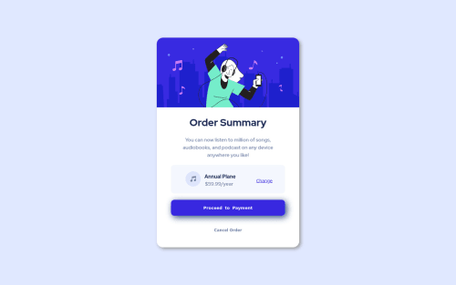
Order summary component HUB

Solution retrospective
Hi there! I'm Angelo a this is my first work ever. Just one month has passed since I've start learning HTML/CSS by myself, so I'm super open to every good/bad feedback.
P.S. I'm from Italy, then I'm so so sorry for my bad English.
Please log in to post a comment
Log in with GitHubCommunity feedback
- @dinahbrito
3, ah sorry, didn't realize it was a button. And yes, that's what I meant by flex box. Maybe give it another try? It makes things a lot easier when you figure it out
Marked as helpful - @pikapikamart
Hey, awesome work on this one and congrats on your first challenge here at FEM! Hope that you found this exciting to do learn from it. The overall layout looks great I think, the only issue visually is the wave-image not showing and if you go to like 440px below, the layout doesn't respond to the screen-size anymore, creating a horizontal scroll.
dinahbrito already gave really great feedback on this one, just going to add some suggestions as well and don't mind me re-iterating some dinahbrito's points again:
- It would be great to have a base styling of this:
html {
  box-sizing: border-box;
  font-size: 100%;
}

body {
 margin: 0;
}

*,
*::before,
*::after {
  box-sizing: inherit
}
This way, handling an element specially its size will be easier because of the
box-sizing- Don't use
position: absolutea very large element. If you inspect your layout, hover on eitherhtmlorbodytag, you will notice that it has no height since its element is beingabsolute. Since you are just using this to center the layout, it would be much better to do it this way. But first, remove these stylings on the.container:
position
top
left
transform
Then on the
bodytag, add these stylings:align-items: center; display: flex; justify-content: center; margin: 0 auto; min-height: 100vh;If some of these stylings are new to you, have a search about
flexbox^^- Also, see that I added the
margin: 0on thebodytag? This is because you set amax-widthon thebodytag. If I haven't added that property, thebodywon't be centered for large-screen-users. - Always have a
mainelement to wrap the main content of the site. For this usemaintag on the.containerselector. - For the vector/illustration on the card, the image is only acting as decorative on this one. Decorative images should be hidden for screen-reader at all times by using
alt=""andaria-hidden="true"to theimgtag or onlyaria-hidden="true"if you are usingsvginstead ofimgtag. - Only use descriptive
alton images that are meaningful and adds content to the site otherwise hide the image for screen-reader users. - Also, when using
imgtag, you don't need to add words that relates to "graphic" such as "image" and others, sinceimgis already an image so no need to describe it as one. - Same for the music-icon, it is only acting as a decorative image and avoid the "icon" word as well.
- A typo, it should be
planand notplane:>. - Also on the
annual plantext, you should be using anh2. When using a heading tag, make sure you are not skipping a level. If you useh4then make sure thath1, h2, h3are all present. - Lastly, to avoid the layout creating a horizontal scroll at the size I mentioned from the start, add a
width: 100%on theimgon the top part of the card so that it will scale along its container.
Aside from those, great job again on this one. Let me know if you have any queries.
Marked as helpful - @dinahbrito
This looks great for your first time! The design is pretty close.
Some feedback:
-
The background image isn’t visible for mobile or desktop. Since your project is already inside of the folder “order-summary-component-main” you don’t need to include that in the url path. Here are some tips that might help: https://css-tricks.com/quick-reminder-about-file-paths/
-
HTML headings have to be in number order. So after an H1 tag, there should be an H2 tag instead of an H4. Then you can style the H2 to be whatever size you want.
-
The button tag should be used only for buttons, so the "change" link and the "cancel order" link should be made with an anchor tag instead. It’ll be less code as you don’t have to remove the button styling.
-
In the future look into “flex box” and “grid”, it will really help with making the mobile version of the design responsive.
Great job!
Marked as helpful -
- @Jorahhh
I've just found out that I forgot to change the folder for the background images from the body. Argh!


Join our Discord community
Join thousands of Frontend Mentor community members taking the challenges, sharing resources, helping each other, and chatting about all things front-end!
Join our Discord