


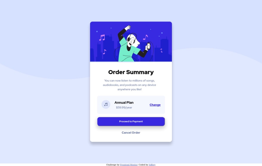

First of all, good job on the delivery.
Although you started with a desktop approach, you could still have a couple of things to set and you won't have to do much on the mobile view. Setting the display flex on the body would have made your work much easier, also you could have set a max-width to the card, that would have helped also with the responsiveness, box shadow should be fixed, bg-color and pattern could be also fixed.
You might check my solution for more details : https://www.frontendmentor.io/solutions/order-summary-card-component-with-flex-MHX37axfl
My approach was mobile-first view. It's much easier to expand to other screen sizes afterwards, not much CSS to write.
Keep up the good work
Marked as helpful
1

