


@mattstuddert
Posted
Congratulations on completing all newbie challenges, Aakash! That's an amazing milestone! 🎉
Your project looks great and matches the design really well. I've got a few small suggestions, which I hope will help.
- When changing the browser size, there are a couple of screen size ranges where the content size changes quite drastically. Around small tablet sizes, the content is very big and around larger tablet to small laptop sizes, the content shrinks quite a bit. It's best to try to gradually scale up content size from mobile all the way through to larger desktop screen sizes.
- You're using JS events on the
lielements for the social media icons and then changing the styles in JS. Instead, I'd recommend adding hover effects in CSS on the anchor tags. The anchor tags are the interactive elements, and it's best to use CSS for hover effects like this. - It's great you're adding
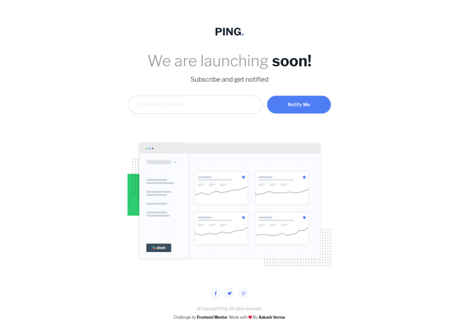
alttext andaria-labelattributes, but try to think about how they'll be read by screen readers and whether they help add context to the content. For example, you've got thealttext of "Ping's illustration main vector image" on theimgelement. I'd say that doesn't add much context, and I'd also say that image doesn't really need analtattribute in the first place as it more of a decorative image to give an idea of what the UI might look like. In this instance, I'd leave thealtattribute blank so screen readers ignore it. On a side note, I wouldn't wrap thisimgelement in afigure. Another example is thearia-labeltext on theinput. Instead of writing "subscriber email address", I would talk directly to the person with something like "Enter your email address".
I hope these tips help. Let me know if you have any questions. I'm looking forward to seeing your junior-level projects! 👍
Marked as helpful
@mattstuddert Wow! Thank you so much. You really told me the right use or meaning of attributes in a logical way.
-
Sometimes while working on design response, some time a question strike to my mind that, am I really adding media queries in right way OR does all developer do/did same just as like me ?
-
My next question, are there any fixed/global screen-width break-points ? Because when it comes to making a design with mobile first approach then I start from 280px then slowly move on bigger one. My lots of time go waste in deciding the media-queries screen size to make design persistant. I think as a experienced developer you can guide me right way of working on frontend design.
I am in learning phase, and I am really happy that I am learning, enhancing my skills, also understanding the way of working on a design with different angle view. Yes! Soon you will see my next solution (Junior Level).
@mattstuddert
Posted
@skyv26, you're welcome! I'm happy to help. To answer your questions, I'd always add media queries when necessary based on the layout I'm building. I would let the content dictate when breakpoints are required and would gradually scale up the typography as necessary. If you're working mobile-first with min-width media queries you can leave all mobile and general styles outside of any media query. In my opinion, 280px is too small for your first query. Typically, it would be around the 400-500px range if you're using min-width, although as I mentioned before it depends on what you're building.
The way you're doing it with min-width and em units is great and pretty common 👍
Marked as helpful
@mattstuddert Again Thank You for reply me back


