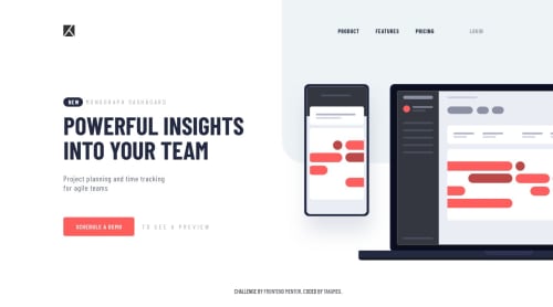
Submitted over 5 years agoA solution to the Project tracking intro component challenge
Position, flex, Sass (scss)

@takameg
Solution retrospective
Any feedback/advice to improve my code is appreciated. The code became a bit unorganized. Was using position: relative; at first, but margin negative didn't work to remove the gap somehow and couldn't find other ways as well. So just changed the code using position: absolute.
Code
Loading...
Please log in to post a comment
Log in with GitHubCommunity feedback
No feedback yet. Be the first to give feedback on M3gumi's solution.
Join our Discord community
Join thousands of Frontend Mentor community members taking the challenges, sharing resources, helping each other, and chatting about all things front-end!
Join our Discord