Submitted almost 2 years agoA solution to the Product preview card component challenge
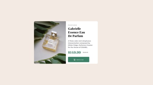
preview card advertisement

@aweezzy
Solution retrospective
This wasn't a hard project, but I think I need some feedback on my code. What did you notice about my project that could further my skills? Are there any better more efficient ways to format my HTML & CSS? Thank you!!
Code
Please log in to post a comment
Log in with GitHubCommunity feedback
- @Amanmawar17
Hola amigos! try to add max width to class container. and half width to image div and text div. Your submission looks good on mobile device. Thank You .
Marked as helpful - @Aimal-125
Bro in your css code, give body and html elements height of 120 or 150vh by using media query with
max-height: 500px;so that your card component becomes visible on small heighted screens as mine j3 mobile device.


Join our Discord community
Join thousands of Frontend Mentor community members taking the challenges, sharing resources, helping each other, and chatting about all things front-end!
Join our Discord