Product Feedback App using React, Redux, Formik, and Tailwind CSS

Solution retrospective
It took me about a month to finish this challenge! It's a hell of a ride, and I'm super happy with the result.
I've been thinking a lot about making this challenge as a full-stack app, but my initial goal is to learn front-end development, so building back-end side is not my top priority (maybe, someday in the near future).
In this challenge, I've learned a lot about Redux. The last time I use Redux is almost 2 years ago. But this time, I'm using Redux toolkit which is super helpful since you don't need to create a boilerplate too much.
Another thing that I've learned is Formik. It was a delightful library to build form. Just like Redux toolkit, it alleviates so many complexities and makes form become easier than ever before. The downside is there's no way to attach 2 submit buttons (Formik assume only one submit button) which is not convenient. At some point, you might need multiple submit buttons.
Responsive UI becomes more challenging as you make a lot of pages, a lot of moving parts, especially on the Suggestion page. Fortunately, I'm using Tailwind CSS, which makes the styling thing become easier and makes a lot of sense. Usually, I'm using SCSS and sometimes it becomes unmanageable once it becomes bigger and bigger.
As always, I'm open to feedback and some improvement. Thank you.
Please log in to post a comment
Log in with GitHubCommunity feedback
- @JeuriMorel
Hey Markus! First, I'd like to congratulate you on tackling this challenge, as it's not as easy one! So good job on that. There are some areas where you can improve the solution, and I'd like to point out a few of them here:
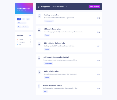
- On the sorting bar, where it says 6 Suggestions, that number should reflect the number of suggestions being shown. If the user deletes, or adds a suggestion, the number should change.
- There doesn't seem to be any form validation. One of the challenge requirements is to not allow users to submit empty forms.
- According to the design files, the comment counter on the right in the suggestions cards should show how many comments in total there are for each suggestion, not just the direct comments, but also the replies to them.
- You're missing a lot of the hover states that the challenge asks for you to show.
- The dropdown menus don't look like the designs. Here it's probably a better idea to create your own menu and not rely on the one HTML gives you.
- Speaking of HTML, the solution does not include semantic HTML; it's using divs for every element. This is not a good idea as it makes it extremely difficult for someone using assistive technology to navigate your site.
- If you were to look at the report above, you will see that the solution has a few accessibility and HTML issues; don't ignore these.
- In the roadmap page, where you have the different columns for Live, Planned, In-Progress, the number showing how many suggestions are in each column is inconsistant. It looks like when in large screen width the numbers are accurate, but if you start out in a smaller window and increase the viewport size, all three columns will show a single number.
Overall though, you did a good job! The responsiveness seemed good to me; I didn't spot any issues with the layout when adjusting screen size. You followed the design pretty closely; even if it's not pixel perfect, it's still very faithful to the challenge.
Here are a couple of informative pages about Semantic HTML :
Marked as helpful

Join our Discord community
Join thousands of Frontend Mentor community members taking the challenges, sharing resources, helping each other, and chatting about all things front-end!
Join our Discord