Skip to content
  • Unlock Pro
  • Log in with GitHub
Solution
Submitted almost 3 years ago

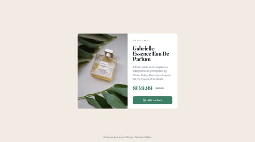
Product preview card component solution

accessibility
Flor•10
@floor096
A solution to the Product preview card component challenge
View live sitePreview (opens in new tab)View codeCode (opens in new tab)

Solution retrospective


-For this i mostly used Flexbox -I had a little dificult time while building the mobile version I would like to recieve some feedback and recommendations Thank you!

Code
Select a file

Please log in to post a comment

Log in with GitHub

Community feedback

  • Lucas 👾•104,160
    @correlucas
    Posted almost 3 years ago

    👾Hello Flor, congratulations for your first solution and 😎 welcome to the Frontend Mentor Coding Community!

    You've used FLEX to create this component this is fine, since is working. In my opinion a better approach is by using GRID.

    For example to build this component with 2 columns all you need to do is create a main block to hold all the content (you can use <main> to wrap), set its width as max-width: 900px (its the container size) and display: grid / grid-template-column: repeat(2, 1fr)(this means that your component will have two columns with 50% of the container width each thats 450px).

    👋 I hope this helps you and happy coding!

    Marked as helpful
  • Warren•650
    @warrenlee
    Posted almost 3 years ago

    Hi Flor, good job on this challenge! Desktop looks perfect but here's a tip on how to start getting the layout respond for mobile.

    Starting with #conteiner change width to 100% and height to auto and add flex-direction: column. On your #img change the width to 100% and since you are using background-image you'll need to set the correct background-image url, add either padding-top to give the element some height or you can use the newly introduced aspect-ratio. Spotted a minor mistake, background-repeat should be set to no-repeat rather than none

    Next, you'll need to sort out the border-radius. I'd recommend to apply it on the #conteiner and adding overflow: hidden to make the rounded corners visible. I would also recommend using the picture tag instead of background-image as you can use media queries to set the image you want to show.

    example:

    <picture>
        <source srcset="/desktop-img.jpg" media="(min-width: 768px;)">
        <img src="/mobile-img.jpg">
    </picture>
    

    I hope this helps!

    Marked as helpful
  • P
    FO•205
    @de-furkan
    Posted almost 3 years ago

    Hey looks great. To improve on the mobile aspect - consider doing the following:

    1. try mobile first approach - build from bottom up - from smaller devices and up to larger devices. This is a great approach.

    2. Also, consider using media queries to add in responsiveness to your design.

    Otherwise, great effort, looks nice :)

    Marked as helpful

Join our Discord community

Join thousands of Frontend Mentor community members taking the challenges, sharing resources, helping each other, and chatting about all things front-end!

Join our Discord
Frontend Mentor logo

Stay up to datewith new challenges, featured solutions, selected articles, and our latest news

Frontend Mentor

  • Unlock Pro
  • Contact us
  • FAQs
  • Become a partner

Explore

  • Learning paths
  • Challenges
  • Solutions
  • Articles

Community

  • Discord
  • Guidelines

For companies

  • Hire developers
  • Train developers
© Frontend Mentor 2019 - 2025
  • Terms
  • Cookie Policy
  • Privacy Policy
  • License

Oops! 😬

You need to be logged in before you can do that.

Log in with GitHub

Oops! 😬

You need to be logged in before you can do that.

Log in with GitHub

How does the accessibility report work?

When a solution is submitted, we use axe-core to run an automated audit of your code.

This picks out common accessibility issues like not using semantic HTML and not having proper heading hierarchies, among others.

This automated audit is fairly surface level, so we encourage to you review the project and code in more detail with accessibility best practices in mind.

How does the CSS report work?

When a solution is submitted, we use stylelint to run an automated check on the CSS code.

We've added some of our own linting rules based on recommended best practices. These rules are prefixed with frontend-mentor/ which you'll see at the top of each issue in the report.

The report will audit 1st-party linked stylesheets, and styles within <style> tags.

How does the HTML validation report work?

When a solution is submitted, we use html-validate to run an automated check on the HTML code.

The report picks out common HTML issues such as not using headings within section elements and incorrect nesting of elements, among others.

Note that the report can pick up “invalid” attributes, which some frameworks automatically add to the HTML. These attributes are crucial for how the frameworks function, although they’re technically not valid HTML. As such, some projects can show up with many HTML validation errors, which are benign and are a necessary part of the framework.

Oops! 😬

You need to be logged in before you can do that.

Log in with GitHub

Oops! 😬

You need to be logged in before you can do that.

Log in with GitHub

Oops! 😬

You need to be logged in before you can do that.

Log in with GitHub