


@rafaelmaiach
Posted
Hey Patrick, congrats on your solution.
About the design question, you could set a max-width for your container. As you already is setting margin: 0 auto, when you define the max-width property, you will have your content centered on screen to a max size you define
@patricktouchette
Posted
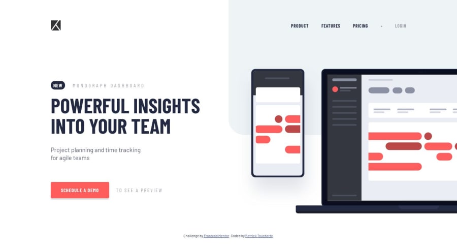
@rafaelmaiach Hi rafael, thats a good idea and it usually works, however given how the image is cut off on the side it looks odd having some whitespace to the right of the image. Seems to me it needs to be on the edge of the screen. Hmm, i did a test with a max-width: 1440px, and margin-right: 0 on the .wrapper, and take just brings it all to the right. Not sure if that looks good though.
@rafaelmaiach
Posted
Yeah, I thought about the image looking like is cut off, but Maybe if you propagate that gray color to the right, instead leaving white, could help? I'll send this solution and question to Matt, maybe he can give us some tips about it

@mattstuddert
Posted
Hey guys, I agree with @rafaelmaiach about the container but I also see your point @patricktouchette about the image being cut off. This was an oversight on my part! I've actually updated the image for the challenge now, which you can grab from here if you like.
I need to get myself an ultra-widescreen so I can pick up on these things sooner! 😅
@patricktouchette
Posted
@mattstuddert Thanks! I added in a media query for 1920px to switch to that updated image. This makes me realize it's hard to work with a split image on the side. Definately upgraded my skills hehe.
Ultra-wide is awesome, you won't regret!
Cheers
