
Solution retrospective
Clean code and it's well identified.
What challenges did you encounter, and how did you overcome them?When I styled the main background of the document, the text on the top container had the background highlighting of the same backgroundColor. So, I removed the highlight by styling the text back to white. Not sure if it's the right thing to do.
What specific areas of your project would you like help with?Deep understanding of Media Queries in CSS.
Please log in to post a comment
Log in with GitHubCommunity feedback
- @EdenWong0
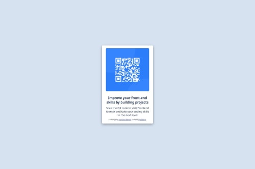
Can remove any unnecessary content such as the footer. Also, might need to add border-radius to the card as well as the size of image to match the design. The font size, font weight, and color for the heading and paragraph should also be changed to match the design.
- @sonnystark
I would look over the naming of elements and classes. Also, if you don't have a H1 or H2, don't start with an H3. It's the only heading there so make it a H1.
The styling is interesting. Maybe you should go over it and really see what everything is doing. Just one very obvious thing is the
<div class="attribution">that is wrapping everything and styled with a pointer as a cursor. Why? :) - P@troy71
Fantastic effort, well done !


Join our Discord community
Join thousands of Frontend Mentor community members taking the challenges, sharing resources, helping each other, and chatting about all things front-end!
Join our Discord