Skip to content
  • Unlock Pro
  • Log in with GitHub
Solution
Submitted 8 months ago

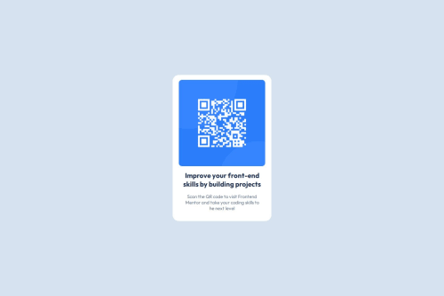
QR code component

bonzoycv•10
@bonzoycv
A solution to the QR code component challenge
View live sitePreview (opens in new tab)View codeCode (opens in new tab)

Solution retrospective


What are you most proud of, and what would you do differently next time?

I'm most proud of completing this challenge in just a couple of hours, despite my limited CSS knowledge. It's incredibly motivating, and I'm eager to tackle more challenges in the future. The experience has boosted my confidence in my ability to learn and apply new skills quickly.

Future Approach

For future projects, I'd approach problem-solving differently:

  • Instead of spending excessive time stuck on a single issue, I'll be more proactive in seeking solutions.
  • I plan to utilize online resources more efficiently:
    • Searching for specific solutions on Google
    • Asking for guidance in coding communities

This approach should help me:

  1. Overcome obstacles more quickly
  2. Reduce frustration
What challenges did you encounter, and how did you overcome them?

The most challenging aspects of this project were:

  1. Implementing Flexbox correctly
  2. Utilizing Media Queries effectively

To tackle these difficulties, I employed the following strategies:

  • Searched various web resources for Flexbox and Media Query tutorials

  • Studied different code examples of responsive web designs

  • Experimented with Flexbox properties to understand their effects

  • Tested different breakpoints in Media Queries to optimize responsiveness

  • When stuck, I broke down the problem into smaller, manageable parts

  • Applied solutions incrementally, testing each change

By overcoming these challenges, I've significantly improved my understanding of responsive web design principles, but I should say that still got some problems understanding how media queries works.

Code
Select a file

Please log in to post a comment

Log in with GitHub

Community feedback

  • P
    Huy Phan•3,430
    @huyphan2210
    Posted 8 months ago

    Hi @bonzoycv, Congrats on completing the first challenge!

    I took a look at your solution and wanted to share some feedback:

    • The card (your main tag) isn’t centered in the viewport (the visible area of a web page on a screen). You’ve already used Flexbox on the body, but you're missing justify-content: center to center it. Typically, using display: flex; flex-direction: column; align-items: center; justify-content: center; on the parent element (in this case, the body) ensures proper centering of child elements. There are exceptions, but this combo works well here. It’s a good idea to understand why these values center content as they do.
    • I noticed you’re using two h1 tags and three p tags for the card content. I think it's better to stick with one h1 and one p in this case. I assume the multiple tags were to match the line breaks in the design, but remember that the number of lines shouldn’t be a hard requirement. If the content changes or grows, those extra tags may cause issues. Matching the design is important, but so is keeping your HTML structure clean and future-proof for easier maintenance.
    • As for media queries, there’s no one right way to use them, but I recommend looking into a mobile-first approach. It’s a good practice to design for smaller screens first and then use media queries to adjust layouts for larger screens.

    Hope this helps!

    Marked as helpful
  • amandaaanh•10
    @amandaaanh
    Posted 8 months ago

    It looks good and it would be better if you adjusted the size of the card according to the design.

Join our Discord community

Join thousands of Frontend Mentor community members taking the challenges, sharing resources, helping each other, and chatting about all things front-end!

Join our Discord
Frontend Mentor logo

Stay up to datewith new challenges, featured solutions, selected articles, and our latest news

Frontend Mentor

  • Unlock Pro
  • Contact us
  • FAQs
  • Become a partner

Explore

  • Learning paths
  • Challenges
  • Solutions
  • Articles

Community

  • Discord
  • Guidelines

For companies

  • Hire developers
  • Train developers
© Frontend Mentor 2019 - 2025
  • Terms
  • Cookie Policy
  • Privacy Policy
  • License

Oops! 😬

You need to be logged in before you can do that.

Log in with GitHub

Oops! 😬

You need to be logged in before you can do that.

Log in with GitHub

How does the accessibility report work?

When a solution is submitted, we use axe-core to run an automated audit of your code.

This picks out common accessibility issues like not using semantic HTML and not having proper heading hierarchies, among others.

This automated audit is fairly surface level, so we encourage to you review the project and code in more detail with accessibility best practices in mind.

How does the CSS report work?

When a solution is submitted, we use stylelint to run an automated check on the CSS code.

We've added some of our own linting rules based on recommended best practices. These rules are prefixed with frontend-mentor/ which you'll see at the top of each issue in the report.

The report will audit 1st-party linked stylesheets, and styles within <style> tags.

How does the HTML validation report work?

When a solution is submitted, we use html-validate to run an automated check on the HTML code.

The report picks out common HTML issues such as not using headings within section elements and incorrect nesting of elements, among others.

Note that the report can pick up “invalid” attributes, which some frameworks automatically add to the HTML. These attributes are crucial for how the frameworks function, although they’re technically not valid HTML. As such, some projects can show up with many HTML validation errors, which are benign and are a necessary part of the framework.

Oops! 😬

You need to be logged in before you can do that.

Log in with GitHub

Oops! 😬

You need to be logged in before you can do that.

Log in with GitHub