Not Found
Not Found
Not Found
Not Found
Not Found
Not Found
Not Found
Not Found
Not Found
Not Found
Not Found
Not Found
Not Found
Not Found
Not Found
Not Found
Not Found
Not Found
Not Found
Not Found

Submitted

QR code component

#sass/scss
LetsFrontendβ€’ 500

@B1N4R1

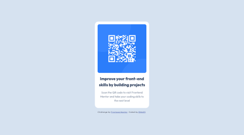
Desktop design screenshot for the QR code component coding challenge

This is a solution for...

  • HTML
  • CSS
1newbie
View challenge

Design comparison


SolutionDesign

Solution retrospective


This was an easy one to do, not much to say since it's a very simple and straight forward design.

I used flexbox to create 2 columns: one for the qr and the other for the text provided, nothing too fancy.

Any suggestions are as always, very much welcome!

Cheers!

Community feedback

Lucas πŸ‘Ύβ€’ 104,560

@correlucas

Posted

πŸ‘ΎHello LetsFrontend, congratulations for your new solution!

Amazing solution here bro, the container is really good done and full responsive.

I've two suggestions for your:

1.Add a margin to the contaier to avoid it touching the screen edges while scaling, try a value around margin: 24px;

.container {
margin: 24px;
}

2.Clean your code by removing the div called <div class="desc">, theres no need to have it since you can wrap everything with the div container with:

See the structure below:

<body>
<div>
<img>
<h1></h1>
<p></p>
</div>
</body>

πŸ‘‹ I hope this helps you and happy coding!

Marked as helpful

1
PhoenixDev22β€’ 16,990

@PhoenixDev22

Posted

Hello LetsFrontend,

Congratulation on finishing another frontend mentor challenge. Your solution looks great. I have few suggestions regarding your solution if you don’t mind:

  • In my opinion, the alternate text should indicate where the Qr code navigate the user : like QR code to frontend mentor. (not describes the image)
  • Adding rel="noopener" or rel="noreferrer" to target="_blank" links. When you link to a page on another site using target=”_blank”`` attribute , you can expose your site to performance and security issues.

Hopefully this feedback helps.

Marked as helpful

0
Davidβ€’ 8,000

@DavidMorgade

Posted

Hello man you did a pretty good job, congrats on finishing the challenge!

I think Lucas already give you the correct path to structure your html, I would also change the div tag for main tag, to avoid the FEM validation for main tags, when you build a simple component or card for a challenge, you should wrap the main content on a main tag, cause that will surely be the pricipal content of your project!

For larger projects where you use this little component just ignore this and wrap it around a section or just a div.

Hope my feedback helps you ! good job!

Marked as helpful

0
LetsFrontendβ€’ 500

@B1N4R1

Posted

Thanks to the three of you: Lucas, David and PhoenixDev22

I took your suggestions into account and applied them to the challenge. Most of them are things that I already knew but forgot to apply them πŸ˜…, like the main and footer landmarks or the margin for the container.

As Lucas pointed out, the div.desk element was clearly needless so I removed it and used flex's gap property to add some spacing between the elements.

Again thanks for the feedback!

0

Please log in to post a comment

Log in with GitHub
Discord logo

Join our Discord community

Join thousands of Frontend Mentor community members taking the challenges, sharing resources, helping each other, and chatting about all things front-end!

Join our Discord