QR CODE PAGE USING HTML AND CSS

Please log in to post a comment
Log in with GitHubCommunity feedback
- P@Islandstone89
HTML:
-
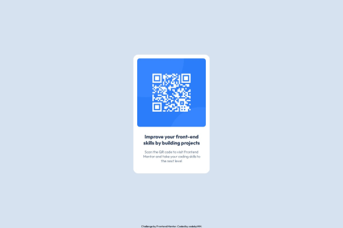
The alt text must also say where it leads(the frontendmentor website). A good alt text would be "QR code leading to the Frontend Mentor website."
-
I would change the heading to a
<h2>- a page should only have one<h1>, reserved for the main heading. As this is a card heading, it would likely not be the main heading on a page with several components. -
Do not use
<br>to force text onto a new line. The text should flow naturally, and all styling, including space between elements, should be done in the CSS. -
Text should always be wrapped in a meaningful element, never in divs alone. Hence, the footer text needs to be wrapped in a
<p>.
CSS:
-
Including a CSS Reset at the top is good practice.
-
I would recommend adding
1remofpaddingon thebody, to ensure the card doesn't touch the edges on small screens. -
On the
body, changeheighttomin-height- this way, the content will not get cut off if it grows beneath the viewport. Remove thewidth, as thebody(and other block elements) take up the full width as the default. I would also addgap: 2rem, and removeposition: fixedon the footer. -
Remove all widths, max-widths and heights in
pxand%. -
Add a
max-widthof around20remon the card, to prevent it from getting too wide on larger screens. -
font-sizemust never be in px. This is a big accessibility issue, as it prevents the font size from scaling with the user's default setting in the browser. Use rem instead. -
Paragraphs have a default value of
font-weight: 400, so there is no need to declare it. -
Since all of the text should be centered, you only need to set
text-align: centeron the body, and remove it elsewhere. The children will inherit the value. -
On the image, add
display: blockandmax-width: 100%- the max-width prevents it from overflowing its container. Without this, an image would overflow if its intrinsic size is wider than the container.max-width: 100%makes the image shrink to fit inside its container.
Marked as helpful -
- @Grimm-N
Thank you for your work on the code! It actually inspired me to add a footer to my project, even though it wasn't in the original assignment. The implementation looks great overall, though I noticed a slight mismatch in the spacing and font size compared to the design. However, I find the execution to be more visually pleasing than the design itself; the text looks more harmonious. Great job!
P.S.: U forgot about the shadow ;-)
Marked as helpful - @amontesino
The font is slightly smaller than the design spec (this could very well be a resolution thing, the font size appears correct in the code!), and the container is missing a box-shadow, but otherwise all other dimensions of the container and elements within it match the spec. Great job using --root variables for colors as well!
Marked as helpful - @hasnatlubaid
great
- P@QLopes22
Your code looks very organized, great use of the comments.


Join our Discord community
Join thousands of Frontend Mentor community members taking the challenges, sharing resources, helping each other, and chatting about all things front-end!
Join our Discord