Skip to content
  • Unlock Pro
  • Log in with GitHub
Profile
OverviewSolutions
25
Comments
68

Natali đŸ‘ģ Grimm

@Grimm-NMoldova1,190 points

Passionate front-end developer with a knack for creating responsive and user-friendly web experiences. I love solving challenges and continuously improving my skills. Always eager to learn new technologies and collaborate with others

I’m currently learning...

Currently diving into advanced CSS techniques, JavaScript frameworks like React, and exploring design principles to enhance my front-end development skills. Excited to build more complex projects and improve my coding efficiency.

Latest solutions

  • đŸ‘ģ Slider Section: Snakes' testimonials (HTML + CSS + JS)

    #python

    Natali đŸ‘ģ Grimmâ€ĸ1,190
    Submitted 6 months ago

    As always, I’d appreciate any advice on improving and adapting the code.


    0 comments
  • đŸ‘ģ Landing Page: Footer and header waves (HTML + Tailwind + JS)

    #tailwind-css#animation

    Natali đŸ‘ģ Grimmâ€ĸ1,190
    Submitted 7 months ago

    Unfortunately, I only noticed the background under the sections with the curved edges at the very end 😅. Maybe someone can share a simple and elegant way to use the provided images for this?


    2 comments
  • đŸ‘ģ Grid Section: Bento (HTML + CSS + JS)

    #animation

    Natali đŸ‘ģ Grimmâ€ĸ1,190
    Submitted 7 months ago

    I would love to hear suggestions on how to make the grid more flexible.


    2 comments
  • Responsive section Coming Soon (html, stylus, js)

    #animation#python#stylus

    Natali đŸ‘ģ Grimmâ€ĸ1,190
    Submitted 7 months ago

    I’m really looking forward to any advice and comments on this work! I know the code can be improved, and I’m eager to work on it!


    3 comments
  • Responsive Subscribe Component (Grid, Flexbox)

    #sass/scss

    Natali đŸ‘ģ Grimmâ€ĸ1,190
    Submitted 7 months ago

    As usual, I’m always open to any advice and comments regarding my work. It helps me grow quickly.


    0 comments
  • Landing page - Intro section (flex, grid m-f w)

    #animation

    Natali đŸ‘ģ Grimmâ€ĸ1,190
    Submitted 7 months ago

    I'd love to hear any advice on how I could further improve or simplify the code!


    1 comment
View more solutions

Latest comments

  • Matthew Sheldonâ€ĸ320
    @MatthewNgabirano
    Submitted 7 months ago
    What are you most proud of, and what would you do differently next time?

    I was able to complete another project from scratch with the help of divs through which I came up with this idea. I am planning to build more projects to become good at what I do.

    What challenges did you encounter, and how did you overcome them?

    Some of the challenges I faced included; coming up with the idea to bring it into real life. Of course, I was able to work out the code and it worked very well.

    What specific areas of your project would you like help with?

    More of CSS and JAVASCRIPT to make more projects more interactive.

    Rothko Painting

    1
    Natali đŸ‘ģ Grimmâ€ĸ1,190
    @Grimm-N
    Posted 7 months ago

    Hi! Your work reminds me of projects from freeCodeCamp.
    You're doing a great job, keep it up! However, you need to upload completed Frontend Mentor challenges that match the task requirements. That's the whole point of doing them — it's how we grow and learn.

  • Yacoub AlDweikâ€ĸ3,110
    @YacoubDweik
    Submitted 7 months ago
    What are you most proud of, and what would you do differently next time?

    I don't like Tailwind or Bootstrap or any other useless CSS framework

    What challenges did you encounter, and how did you overcome them?

    I don't like Tailwind or Bootstrap or any other useless CSS framework x2

    What specific areas of your project would you like help with?

    I don't like Tailwind or Bootstrap or any other useless CSS framework x3

    Notifications page Using Tailwind

    #tailwind-css
    4
    Natali đŸ‘ģ Grimmâ€ĸ1,190
    @Grimm-N
    Posted 7 months ago

    @YacoubDweik, my friend I feel you, I hate it too...

    Marked as helpful
  • Sara-Mousaâ€ĸ120
    @Sarah-Mousa
    Submitted 7 months ago
    What are you most proud of, and what would you do differently next time?

    This is my first time using JS in my code. I used to study it, but I never used it in real projects.

    What challenges did you encounter, and how did you overcome them?

    I faced many problems in my code first the responsive design, second JS actions on the buttons, it took days to finish it. I fed up many times, but Al-hammdullah I searched more and more until I managed to set the solution.

    What specific areas of your project would you like help with?

    Java event listener and setting the best HTML structure to get it easily using JavaScript. more than this How to arrange my steps, I mean I asked myself many questions while I doing it like: Shall I start with the mobile screen or desktop one, How can I do the active button, where to put it, How I will change it in the other screen. It was a hard one for me.

    Article Preview

    #accessibility
    1
    Natali đŸ‘ģ Grimmâ€ĸ1,190
    @Grimm-N
    Posted 7 months ago

    Amazing work! 🤩 You’re doing a fantastic job, and I can see how much effort you’ve put into this. Keep it up! 🎉 Here are a few tips that might help you refine your design and code:

    1. Mobile-first approach – Every beginner struggles with the decision: should I design for desktop first or mobile? I’ve been there too! 😅 The general recommendation is to start with mobile-first design. Why? Because it’s easier to scale up for larger screens and you’ll end up writing fewer media queries overall.

    2. **Place your `` tag. This ensures the HTML content loads first, preventing delays in rendering. This approach also improves user experience and reduces page load issues.

    3. Group elements appropriately – Instead of using <article> for grouping, consider using semantic tags like <section> or <div> (if it doesn’t require semantic meaning). Articles are generally intended for standalone content like blog posts or news items. Using appropriate tags keeps your code clean and meaningful.

    4. Avoid using pixels everywhere – Instead of px, use responsive units like rem, em, or percentages. These units adapt better to user settings and different screen sizes, ensuring a more flexible and accessible layout. Pixels are fixed and can make your design less user-friendly on various devices.

    5. Remember 320px screens – While most devices have larger screens nowadays, 320px-wide displays still exist. To ensure your design works well on smaller screens, you can set the width of cards to 90% or 90vw. This prevents cards from sticking to the edges of the screen and gives a cleaner, more balanced layout.

    Keep up the awesome work! đŸ’Ē The more you experiment, the faster you’ll grow as a developer. 🌟

    Marked as helpful
  • P
    Igorâ€ĸ290
    @whiteriver-dev
    Submitted 7 months ago
    What are you most proud of, and what would you do differently next time?

    Finally managed to get it to fit right.

    What challenges did you encounter, and how did you overcome them?

    Was hard to make it responsive, while making sure all the content is fits in the containers. Also as the screen sizes get bigger - it starts looking slightly more awkward.

    What specific areas of your project would you like help with?

    I'd like to know any ideas on how to make the overall design look better on larger, more awkward screen sizes.

    Also, how to make text fit the container depending on the size of the container.

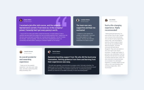
    Testimonials Grid w/Grid, Flex, Responsive Layout

    1
    Natali đŸ‘ģ Grimmâ€ĸ1,190
    @Grimm-N
    Posted 7 months ago

    Amazing work! 👏 I love how much effort you’re putting into this design – it really shows. Keep it up! 🎉 Here are a few suggestions to help refine things even further:

    1. Use relative units instead of pixels – Opt for units like rem or em instead of px. These units adapt better to different screen sizes and user preferences, making your design more flexible and accessible. For example, if someone has increased their browser’s default font size, rem and em will adjust accordingly, while px remains fixed.

    2. Tackle font scaling on large screens – When using em, you might notice fonts becoming too large on bigger screens because em scales based on its parent. To avoid this, try using a combination of clamp for font sizes. For example:

      font-size: clamp(1rem, 2vw, 1.5rem);
      

      This allows you to set a minimum and maximum font size, ensuring it stays proportional without getting out of control.

    3. Plan for medium screen sizes – For screens that are not too small or too large (like tablets), consider a transitional layout. For example, instead of single-column items, you could use a grid with two columns to optimize space usage and make the design look more structured:

      .grid-container {
          display: grid;
          grid-template-columns: repeat(2, 1fr);
          gap: 16px;
      }
      

      This keeps your layout balanced and user-friendly across different devices.

    4. Download and use custom fonts – It’s better to download fonts and add them using @font-face in your CSS. This gives you control over font loading speed, avoids third-party service dependencies, and ensures your design stays consistent even if the external service has issues.

    You're doing fantastic work! Keep experimenting, and you’ll keep improving! 🌟

    Marked as helpful
  • Tanyaradzwa(Tanya)â€ĸ80
    @Tanya-abi
    Submitted 7 months ago
    What are you most proud of, and what would you do differently next time?

    I am proud at my progress and would do nothing differently. I enjoyed the whole activity.

    What challenges did you encounter, and how did you overcome them?

    I struggled with placing the contents of the card in center while maintaining the left side line-up but I figured it out. I also struggled with adjusting the blog image to the right width and height when it is under 1140px. It seems to do it's own thing and I don't know how to fix it.

    What specific areas of your project would you like help with?

    I need help on how to adjust the svg blog image to match the specified width and height by figma(279 x 200), for a screen that is under 1140px.

    Responsive Blog review card with html and css

    1
    Natali đŸ‘ģ Grimmâ€ĸ1,190
    @Grimm-N
    Posted 7 months ago

    Awesome work! 👏 I really love how clean and well-structured your design is – great job so far! Here are a few suggestions to make it even better:

    1. Consider small screen sizes – Remember that some users may still have devices with a width of 320px. It’s a good idea to plan your design for these smaller screens as well. For example, you can set the width of your card to 90% or 90vw to prevent it from sticking to the edges of the viewport. This ensures a better user experience on all devices. 📱

    2. Download and use custom fonts – It’s better to download fonts and add them using @font-face in your CSS. This gives you control over font loading speed, avoids third-party service dependencies, and ensures your design stays consistent even if the external service has issues. 💡

    3. Add classes to all elements – Giving each element a class improves code readability and makes your styles reusable and scalable. It also keeps your HTML organized and avoids conflicts when styling multiple elements. Using a methodology like BEM (Block-Element-Modifier) can help create a clear and maintainable structure for your CSS. For example:

      <div class="card">
          <h2 class="card__title">Title</h2>
          <p class="card__text">Some text here</p>
      </div>
      
    4. Use relative units instead of pixels – Try using rem or em instead of px. These units scale better for responsiveness and accessibility, especially when users zoom or have different base font sizes set in their browsers. This makes your design more user-friendly and adaptive! 🌟

    Keep up the amazing work! You’re doing great! 🎉

    Marked as helpful
  • Rafael Do RosÃĄrioâ€ĸ10
    @RafaSpeak
    Submitted 7 months ago
    What are you most proud of, and what would you do differently next time?

    Good training

    What challenges did you encounter, and how did you overcome them?

    Good training

    What specific areas of your project would you like help with?

    Good training

    Display Flex

    #react
    1
    Natali đŸ‘ģ Grimmâ€ĸ1,190
    @Grimm-N
    Posted 7 months ago

    Great job! I'm absolutely impressed by how responsive the design is! 👏 It looks really smooth across different screen sizes. Here are a few small suggestions to make it even better:

    1. Use relative units instead of pixels – Try using rem or em instead of px for better scalability and accessibility. This makes the design more flexible and adaptable for different screen sizes and user preferences (like zooming). 📏

    2. Use clamp for adaptive font sizes – You can use clamp() to make your font sizes adjust fluidly depending on the screen width, ensuring the text remains readable on both small and large screens. For example:
      font-size: clamp(1rem, 2vw, 1.5rem);
      This approach is great for responsiveness! 📐

    3. Consider using downloaded fonts – If you're using custom fonts, it's often better to download them (using @font-face), instead of relying on web font services. This way, you control the loading speed and avoid dependency on third-party services. đŸ“Ĩ

    Keep up the great work! 🎉

View more comments
Frontend Mentor logo

Stay up to datewith new challenges, featured solutions, selected articles, and our latest news

Frontend Mentor

  • Unlock Pro
  • Contact us
  • FAQs
  • Become a partner

Explore

  • Learning paths
  • Challenges
  • Solutions
  • Articles

Community

  • Discord
  • Guidelines

For companies

  • Hire developers
  • Train developers
Š Frontend Mentor 2019 - 2025
  • Terms
  • Cookie Policy
  • Privacy Policy
  • License

Oops! đŸ˜Ŧ

You need to be logged in before you can do that.

Log in with GitHub

Mentor of the Week - 2nd Place

This badge is awarded to the 2nd placed community member on the weekly Wall of Fame.

Fun fact

Keypunches were used in early computing to punch precise holes in stiff paper card. The punched cards were then used for data input, output, and storage. No code linters or auto-complete suggestions to help out back then! 😅

Oops! đŸ˜Ŧ

You need to be logged in before you can do that.

Log in with GitHub

Oops! đŸ˜Ŧ

You need to be logged in before you can do that.

Log in with GitHub

Oops! đŸ˜Ŧ

You need to be logged in before you can do that.

Log in with GitHub

Oops! đŸ˜Ŧ

You need to be logged in before you can do that.

Log in with GitHub

Oops! đŸ˜Ŧ

You need to be logged in before you can do that.

Log in with GitHub

Oops! đŸ˜Ŧ

You need to be logged in before you can do that.

Log in with GitHub

Oops! đŸ˜Ŧ

You need to be logged in before you can do that.

Log in with GitHub

Oops! đŸ˜Ŧ

You need to be logged in before you can do that.

Log in with GitHub

Oops! đŸ˜Ŧ

You need to be logged in before you can do that.

Log in with GitHub

Oops! đŸ˜Ŧ

You need to be logged in before you can do that.

Log in with GitHub

Oops! đŸ˜Ŧ

You need to be logged in before you can do that.

Log in with GitHub

Oops! đŸ˜Ŧ

You need to be logged in before you can do that.

Log in with GitHub

Oops! đŸ˜Ŧ

You need to be logged in before you can do that.

Log in with GitHub

Oops! đŸ˜Ŧ

You need to be logged in before you can do that.

Log in with GitHub

Oops! đŸ˜Ŧ

You need to be logged in before you can do that.

Log in with GitHub

Oops! đŸ˜Ŧ

You need to be logged in before you can do that.

Log in with GitHub

Oops! đŸ˜Ŧ

You need to be logged in before you can do that.

Log in with GitHub

Oops! đŸ˜Ŧ

You need to be logged in before you can do that.

Log in with GitHub

Oops! đŸ˜Ŧ

You need to be logged in before you can do that.

Log in with GitHub

Oops! đŸ˜Ŧ

You need to be logged in before you can do that.

Log in with GitHub

Oops! đŸ˜Ŧ

You need to be logged in before you can do that.

Log in with GitHub

Oops! đŸ˜Ŧ

You need to be logged in before you can do that.

Log in with GitHub

Oops! đŸ˜Ŧ

You need to be logged in before you can do that.

Log in with GitHub

Oops! đŸ˜Ŧ

You need to be logged in before you can do that.

Log in with GitHub

Oops! đŸ˜Ŧ

You need to be logged in before you can do that.

Log in with GitHub

Oops! đŸ˜Ŧ

You need to be logged in before you can do that.

Log in with GitHub

Oops! đŸ˜Ŧ

You need to be logged in before you can do that.

Log in with GitHub

Oops! đŸ˜Ŧ

You need to be logged in before you can do that.

Log in with GitHub

Oops! đŸ˜Ŧ

You need to be logged in before you can do that.

Log in with GitHub

Oops! đŸ˜Ŧ

You need to be logged in before you can do that.

Log in with GitHub