Skip to content
  • Unlock Pro
  • Log in with GitHub
Profile
OverviewSolutions
25
Comments
68
Natali đŸ‘ģ Grimm
@Grimm-N

All comments

  • Matthew Sheldonâ€ĸ320
    @MatthewNgabirano
    Submitted 7 months ago
    What are you most proud of, and what would you do differently next time?

    I was able to complete another project from scratch with the help of divs through which I came up with this idea. I am planning to build more projects to become good at what I do.

    What challenges did you encounter, and how did you overcome them?

    Some of the challenges I faced included; coming up with the idea to bring it into real life. Of course, I was able to work out the code and it worked very well.

    What specific areas of your project would you like help with?

    More of CSS and JAVASCRIPT to make more projects more interactive.

    Rothko Painting

    1
    Natali đŸ‘ģ Grimmâ€ĸ1,190
    @Grimm-N
    Posted 7 months ago

    Hi! Your work reminds me of projects from freeCodeCamp.
    You're doing a great job, keep it up! However, you need to upload completed Frontend Mentor challenges that match the task requirements. That's the whole point of doing them — it's how we grow and learn.

  • Yacoub AlDweikâ€ĸ3,270
    @YacoubDweik
    Submitted 8 months ago
    What are you most proud of, and what would you do differently next time?

    I don't like Tailwind or Bootstrap or any other useless CSS framework

    What challenges did you encounter, and how did you overcome them?

    I don't like Tailwind or Bootstrap or any other useless CSS framework x2

    What specific areas of your project would you like help with?

    I don't like Tailwind or Bootstrap or any other useless CSS framework x3

    Notifications page Using Tailwind

    #tailwind-css
    4
    Natali đŸ‘ģ Grimmâ€ĸ1,190
    @Grimm-N
    Posted 7 months ago

    @YacoubDweik, my friend I feel you, I hate it too...

    Marked as helpful
  • Sara-Mousaâ€ĸ120
    @Sarah-Mousa
    Submitted 8 months ago
    What are you most proud of, and what would you do differently next time?

    This is my first time using JS in my code. I used to study it, but I never used it in real projects.

    What challenges did you encounter, and how did you overcome them?

    I faced many problems in my code first the responsive design, second JS actions on the buttons, it took days to finish it. I fed up many times, but Al-hammdullah I searched more and more until I managed to set the solution.

    What specific areas of your project would you like help with?

    Java event listener and setting the best HTML structure to get it easily using JavaScript. more than this How to arrange my steps, I mean I asked myself many questions while I doing it like: Shall I start with the mobile screen or desktop one, How can I do the active button, where to put it, How I will change it in the other screen. It was a hard one for me.

    Article Preview

    #accessibility
    1
    Natali đŸ‘ģ Grimmâ€ĸ1,190
    @Grimm-N
    Posted 8 months ago

    Amazing work! 🤩 You’re doing a fantastic job, and I can see how much effort you’ve put into this. Keep it up! 🎉 Here are a few tips that might help you refine your design and code:

    1. Mobile-first approach – Every beginner struggles with the decision: should I design for desktop first or mobile? I’ve been there too! 😅 The general recommendation is to start with mobile-first design. Why? Because it’s easier to scale up for larger screens and you’ll end up writing fewer media queries overall.

    2. **Place your `` tag. This ensures the HTML content loads first, preventing delays in rendering. This approach also improves user experience and reduces page load issues.

    3. Group elements appropriately – Instead of using <article> for grouping, consider using semantic tags like <section> or <div> (if it doesn’t require semantic meaning). Articles are generally intended for standalone content like blog posts or news items. Using appropriate tags keeps your code clean and meaningful.

    4. Avoid using pixels everywhere – Instead of px, use responsive units like rem, em, or percentages. These units adapt better to user settings and different screen sizes, ensuring a more flexible and accessible layout. Pixels are fixed and can make your design less user-friendly on various devices.

    5. Remember 320px screens – While most devices have larger screens nowadays, 320px-wide displays still exist. To ensure your design works well on smaller screens, you can set the width of cards to 90% or 90vw. This prevents cards from sticking to the edges of the screen and gives a cleaner, more balanced layout.

    Keep up the awesome work! đŸ’Ē The more you experiment, the faster you’ll grow as a developer. 🌟

    Marked as helpful
  • P
    Igorâ€ĸ290
    @whiteriver-dev
    Submitted 8 months ago
    What are you most proud of, and what would you do differently next time?

    Finally managed to get it to fit right.

    What challenges did you encounter, and how did you overcome them?

    Was hard to make it responsive, while making sure all the content is fits in the containers. Also as the screen sizes get bigger - it starts looking slightly more awkward.

    What specific areas of your project would you like help with?

    I'd like to know any ideas on how to make the overall design look better on larger, more awkward screen sizes.

    Also, how to make text fit the container depending on the size of the container.

    Testimonials Grid w/Grid, Flex, Responsive Layout

    1
    Natali đŸ‘ģ Grimmâ€ĸ1,190
    @Grimm-N
    Posted 8 months ago

    Amazing work! 👏 I love how much effort you’re putting into this design – it really shows. Keep it up! 🎉 Here are a few suggestions to help refine things even further:

    1. Use relative units instead of pixels – Opt for units like rem or em instead of px. These units adapt better to different screen sizes and user preferences, making your design more flexible and accessible. For example, if someone has increased their browser’s default font size, rem and em will adjust accordingly, while px remains fixed.

    2. Tackle font scaling on large screens – When using em, you might notice fonts becoming too large on bigger screens because em scales based on its parent. To avoid this, try using a combination of clamp for font sizes. For example:

      font-size: clamp(1rem, 2vw, 1.5rem);
      

      This allows you to set a minimum and maximum font size, ensuring it stays proportional without getting out of control.

    3. Plan for medium screen sizes – For screens that are not too small or too large (like tablets), consider a transitional layout. For example, instead of single-column items, you could use a grid with two columns to optimize space usage and make the design look more structured:

      .grid-container {
          display: grid;
          grid-template-columns: repeat(2, 1fr);
          gap: 16px;
      }
      

      This keeps your layout balanced and user-friendly across different devices.

    4. Download and use custom fonts – It’s better to download fonts and add them using @font-face in your CSS. This gives you control over font loading speed, avoids third-party service dependencies, and ensures your design stays consistent even if the external service has issues.

    You're doing fantastic work! Keep experimenting, and you’ll keep improving! 🌟

    Marked as helpful
  • Tanyaradzwa(Tanya)â€ĸ80
    @Tanya-abi
    Submitted 8 months ago
    What are you most proud of, and what would you do differently next time?

    I am proud at my progress and would do nothing differently. I enjoyed the whole activity.

    What challenges did you encounter, and how did you overcome them?

    I struggled with placing the contents of the card in center while maintaining the left side line-up but I figured it out. I also struggled with adjusting the blog image to the right width and height when it is under 1140px. It seems to do it's own thing and I don't know how to fix it.

    What specific areas of your project would you like help with?

    I need help on how to adjust the svg blog image to match the specified width and height by figma(279 x 200), for a screen that is under 1140px.

    Responsive Blog review card with html and css

    1
    Natali đŸ‘ģ Grimmâ€ĸ1,190
    @Grimm-N
    Posted 8 months ago

    Awesome work! 👏 I really love how clean and well-structured your design is – great job so far! Here are a few suggestions to make it even better:

    1. Consider small screen sizes – Remember that some users may still have devices with a width of 320px. It’s a good idea to plan your design for these smaller screens as well. For example, you can set the width of your card to 90% or 90vw to prevent it from sticking to the edges of the viewport. This ensures a better user experience on all devices. 📱

    2. Download and use custom fonts – It’s better to download fonts and add them using @font-face in your CSS. This gives you control over font loading speed, avoids third-party service dependencies, and ensures your design stays consistent even if the external service has issues. 💡

    3. Add classes to all elements – Giving each element a class improves code readability and makes your styles reusable and scalable. It also keeps your HTML organized and avoids conflicts when styling multiple elements. Using a methodology like BEM (Block-Element-Modifier) can help create a clear and maintainable structure for your CSS. For example:

      <div class="card">
          <h2 class="card__title">Title</h2>
          <p class="card__text">Some text here</p>
      </div>
      
    4. Use relative units instead of pixels – Try using rem or em instead of px. These units scale better for responsiveness and accessibility, especially when users zoom or have different base font sizes set in their browsers. This makes your design more user-friendly and adaptive! 🌟

    Keep up the amazing work! You’re doing great! 🎉

    Marked as helpful
  • Rafael Do RosÃĄrioâ€ĸ10
    @RafaSpeak
    Submitted 8 months ago
    What are you most proud of, and what would you do differently next time?

    Good training

    What challenges did you encounter, and how did you overcome them?

    Good training

    What specific areas of your project would you like help with?

    Good training

    Display Flex

    #react
    1
    Natali đŸ‘ģ Grimmâ€ĸ1,190
    @Grimm-N
    Posted 8 months ago

    Great job! I'm absolutely impressed by how responsive the design is! 👏 It looks really smooth across different screen sizes. Here are a few small suggestions to make it even better:

    1. Use relative units instead of pixels – Try using rem or em instead of px for better scalability and accessibility. This makes the design more flexible and adaptable for different screen sizes and user preferences (like zooming). 📏

    2. Use clamp for adaptive font sizes – You can use clamp() to make your font sizes adjust fluidly depending on the screen width, ensuring the text remains readable on both small and large screens. For example:
      font-size: clamp(1rem, 2vw, 1.5rem);
      This approach is great for responsiveness! 📐

    3. Consider using downloaded fonts – If you're using custom fonts, it's often better to download them (using @font-face), instead of relying on web font services. This way, you control the loading speed and avoid dependency on third-party services. đŸ“Ĩ

    Keep up the great work! 🎉

  • Dortey Tettehâ€ĸ60
    @DorteyTetteh
    Submitted 8 months ago
    What are you most proud of, and what would you do differently next time?

    I am glad i was able to start the project and complete it.

    What challenges did you encounter, and how did you overcome them?

    i encountered some challenges with wrapping the text like it looked like in the design

    What specific areas of your project would you like help with?

    Gladly i was able to complete all so i am good

    Box Model for the margins and the paddings

    2
    Natali đŸ‘ģ Grimmâ€ĸ1,190
    @Grimm-N
    Posted 8 months ago

    Hey, great work! 🌟 You're doing awesome, and I love seeing your progress. Just a couple of small tips:

    1. Instead of pixels, try using relative units like em, rem, or percentages—they're more flexible and adapt better to different screen sizes. For example, rem scales beautifully with the user's default font size, keeping things consistent.

    2. Since 320px screens are still a thing 📱, consider using 90vw or 90% for your cards on smaller screens. This way, they won’t stick to the edges of the window and will look more polished.

    Keep it up! You're nailing this! 🚀

    Marked as helpful
  • duojet2ezâ€ĸ20
    @duojet2ez
    Submitted 8 months ago
    What are you most proud of, and what would you do differently next time?

    I believe I have a largely accurate page that gets dimensions right and is minimally responsive.

    What challenges did you encounter, and how did you overcome them?

    Trying to figure out how to lay out elements on the page, things like centering a div vertically and horizontally inside of a container.. also importing and working with google fonts. I am still getting used to figma files.

    What specific areas of your project would you like help with?

    I made classes for every bit of text so I have full control over positioning, font weight, etc... but I am wondering if a better approach exists.

    Blog Preview Card

    2
    Natali đŸ‘ģ Grimmâ€ĸ1,190
    @Grimm-N
    Posted 8 months ago

    You're doing fantastic—seriously, great work! 👏✨ I love seeing how much effort you're putting into this. Here are a few suggestions to refine your approach even more:

    1ī¸âƒŖ Instead of pixels, try using relative units like em, rem, or %. They make your design more flexible and responsive to different screen sizes, which is essential in modern web development. 🌍

    2ī¸âƒŖ When naming your classes, following the BEM (Block-Element-Modifier) methodology can be super helpful. For instance:

    <div class="card">
      <div class="card__header">Header</div>
      <div class="card__body">Content</div>
      <div class="card__button card__button--active">Button</div>
    </div>
    

    This keeps your code clean, easy to understand, and scalable. Future-you will appreciate it! 🙌

    3ī¸âƒŖ I noticed you have some inline styles in your HTML. These are great for quick tests, but if you already have a separate CSS file, move them there or delete them for cleaner, more organized code. 🧹

    You're on the right track—keep it up! Your projects are going to look incredible! 🎉

  • Adhizahâ€ĸ50
    @Adhizah
    Submitted 8 months ago
    What are you most proud of, and what would you do differently next time?

    What I’m Most Proud Of

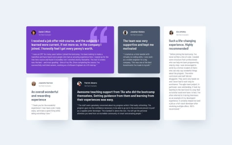
    • Clean Layout and Design: I successfully implemented a visually appealing layout that closely matches the design provided by Frontend Mentor.

    • Improved CSS Skills: I gained confidence in using CSS properties like border-radius, padding, and layout techniques.

    • Project Completion: I’m proud to have completed the challenge and learned new techniques along the way.

    What I Would Do Differently

    Add Media Queries: I would enhance responsiveness by adding media queries to better adapt the design to different screen sizes.

    What challenges did you encounter, and how did you overcome them?

    Challenges I Encountered and How I Overcame Them

    Challenge:

    I initially wanted to use only the box model to structure the layout, avoiding modern layout techniques like Flexbox. However, aligning and centering the elements within the container using just the box model proved difficult. I found it challenging to achieve the desired vertical and horizontal alignment across different screen sizes.

    How I Overcame It:

    After experimenting with the box model, I decided to use Flexbox for centering the content within the container. Flexbox made it much easier to align elements both vertically and horizontally, while maintaining a clean and responsive layout. This switch helped me save time and produce a more consistent result, even though it meant stepping away from my original intent of using only the box model.

    What specific areas of your project would you like help with?

    Specific Areas I’d Like Help With

    I would really appreciate help with understanding Flexbox more deeply. While I used it for centering elements in my layout, I’m still not fully confident in how to apply its full range of capabilities. Specifically, I would love more clarity on:

    1. Flexbox Container Properties: How to effectively use properties like justify-content, align-items, and flex-direction to create flexible and responsive layouts.

    2. Flexbox Item Alignment: Understanding the different ways to align individual flex items within the container, particularly in more complex layouts.

    3. Flexbox vs Grid: When to use Flexbox vs CSS Grid, and how to determine which one is best suited for different layout scenarios.

    Any guidance or resources that explain these concepts in detail would be greatly appreciated!

    QR-CODE component using html and css

    1
    Natali đŸ‘ģ Grimmâ€ĸ1,190
    @Grimm-N
    Posted 8 months ago

    You're doing awesome! Your effort and attention to detail really shine through—keep it up! 🌟

    Here are a couple of tips to take your work to the next level:

    1ī¸âƒŖ Instead of using pixels, consider using em, rem, or %. Why? They adapt better to different screen sizes, making your design more responsive and user-friendly across devices. 🚀

    2ī¸âƒŖ Always assign classes to your elements! This makes your code easier to manage and avoids confusion. Following the BEM (Block-Element-Modifier) methodology can make it even better. For example:

    <div class="button button__icon button__icon--active"></div>
    

    With BEM, your code stays neat, scalable, and easy to update. Trust me, future-you will thank you! 💡

    Keep going—you’re making amazing progress! 🙌🎉

    Marked as helpful
  • ROARâ€ĸ70
    @R04R1NG
    Submitted 8 months ago
    What are you most proud of, and what would you do differently next time?

    As a beginner, I created several divs and CSS selectors on my first attempt. I realized that this approach was inefficient, so I decided to read and watch tutorials on HTML and CSS. On my second attempt, I managed to reduce the number of lines by grouping elements more efficiently.

    What challenges did you encounter, and how did you overcome them?

    I am not yet familiar with CSS variables, so I ended up going back and forth with the style guide to ensure accuracy and achieve a pixel-perfect design. If I had used CSS variables, it would probably have sped up the process. I’ll make sure to implement CSS variables in my future projects.

    What specific areas of your project would you like help with?

    So far, I have not encountered any major issues in this project. However, with my limited knowledge, this path feels a bit unclear, and I’m not sure what questions to ask yet. I’ll continue to explore and learn so that I can seek feedback and guidance on specific areas in future projects.

    QR Code component

    2
    Natali đŸ‘ģ Grimmâ€ĸ1,190
    @Grimm-N
    Posted 8 months ago

    Your work is looking fantastic—seriously, keep it up! 🌟 Every step forward shows your dedication.

    Here are a few pointers to make it even better:

    1ī¸âƒŖ Pixels? Try switching to em, rem, or % instead. They’re way more flexible and adapt beautifully to different screen sizes. This helps your designs stay consistent across devices. 📱✨

    2ī¸âƒŖ On smaller screens, set your card width to 90vw or 90%. This keeps it clean and prevents it from sticking awkwardly to the edges. It’s a game-changer for responsive layouts! đŸ–ŧī¸

    3ī¸âƒŖ Always give your elements classes! It makes your code more manageable and readable. Plus, following the BEM (Block-Element-Modifier) method keeps everything structured. Example:

    <div class="card card__image card__image--highlighted"></div>
    

    BEM keeps your styles clear and scalable, especially as your project grows. 🚀

    Keep up the amazing work—you’re absolutely smashing it! đŸ’Ē🎉

  • Sourov Islamâ€ĸ200
    @developertaskin
    Submitted 8 months ago
    What are you most proud of, and what would you do differently next time?

    I am proud of having finished it with quality in less time than the previous ones, even without having the Figma file.

    If I were starting now, I would probably use CSS Grid combined with Flexbox because it would make positioning the elements easier and faster.

    What challenges did you encounter, and how did you overcome them?

    It was a layout that was essentially in lines. I challenged myself to use only Flexbox to solve it. I had to watch some classes and consult references on how Flexbox works. I asked questions in the GPT Chat mainly about how relative measurements work. Several sources of reference.

    What specific areas of your project would you like help with?

    This particular project is pretty straightforward. I think I just need to practice more by doing other projects.

    Responsive Social Links.

    1
    Natali đŸ‘ģ Grimmâ€ĸ1,190
    @Grimm-N
    Posted 8 months ago

    Your project is coming along great—seriously, amazing work! 🎉 It’s awesome to see your progress and dedication.

    Here are a few tips to keep leveling up:

    1ī¸âƒŖ Quality > Speed, every time. It’s better to take your time and nail it than rush and miss details. 🚀

    2ī¸âƒŖ Stick to the design! Following the layout for sizes, placement, and functionality not only builds your skills but also pushes you to think like a pro designer. 🎨

    3ī¸âƒŖ Pro tip: Even without Figma files, the screenshots of the original design are gold. Use them wisely to match element sizes and spacing. 📐

    4ī¸âƒŖ Ditch the pixels! Opt for responsive units like em, rem, or %. They’re more flexible and help your design shine on any screen size. ✨

    5ī¸âƒŖ For smaller screens, try setting the card width to 90vw or 90%. It’ll keep things clean and prevent that awkward sticking-to-the-edges look.

    Keep going—you’re crushing it! đŸ’Ē🌟

    Marked as helpful
  • TGFâ€ĸ80
    @thecodefan
    Submitted 8 months ago
    What are you most proud of, and what would you do differently next time?

    For my first attempt, i think i did a good enough job of replicating the website. Though, my usage of excess divs. and questionable ways of positioning elements might need work in the future.

    What challenges did you encounter, and how did you overcome them?

    My biggest challenge was positioning the elements, using flexbox and positioning , i managed to make it generally the same as the preview.

    What specific areas of your project would you like help with?

    I'm dissatisfied with the way i positioned the elements, though they get the job done, they feel very inelegant and forced.

    QR-code-component

    2
    Natali đŸ‘ģ Grimmâ€ĸ1,190
    @Grimm-N
    Posted 8 months ago

    Your work is looking awesome! 🎉 It's clear you’ve put a lot of effort into this, and it’s paying off.

    Quick suggestion: it seems like the preview isn’t showing the card properly because the repository link you shared doesn’t point to the latest version of your project. đŸ–ŧī¸ Try sharing this link instead and upload a fresh screenshot of your work. This will ensure your amazing design gets the spotlight it deserves. 🌟 Keep rocking it!

    Marked as helpful
  • Mayenâ€ĸ440
    @Mayen007
    Submitted 8 months ago
    What are you most proud of, and what would you do differently next time?

    I am proud of how fast I was able to complete the challenge.

    What specific areas of your project would you like help with?

    Any feedback is gladly welcomed!

    Blog Preview Card

    #accessibility#pure-css
    2
    Natali đŸ‘ģ Grimmâ€ĸ1,190
    @Grimm-N
    Posted 8 months ago

    Absolutely love what you've done here! 🚀 Your creativity shines through, and the effort you’ve put in is crystal clear.

    One tip though — consider adding a new screenshot of your work. 💡 Remember, screenshots are like the face of your project; they give the first impression. Right now, the system preview isn’t showcasing your card as intended, so a fresh screenshot would really help it stand out and do justice to your awesome work. 😊 Keep it up!

    Marked as helpful
  • Rahana Suleimanâ€ĸ190
    @Rahana23
    Submitted 8 months ago
    What are you most proud of, and what would you do differently next time?

    Completing the project.

    What challenges did you encounter, and how did you overcome them?

    No challenges was encountered.

    What specific areas of your project would you like help with?

    All suggestions are welcomed.

    Product Preview

    #pure-css
    1
    Natali đŸ‘ģ Grimmâ€ĸ1,190
    @Grimm-N
    Posted 8 months ago

    I gotta say, your work is looking đŸ”Ĩ! Seriously, I love it! 😍 Here’s a little nugget of advice: we really test our skills when we try to recreate a layout that matches the design to the T. That’s when we level up—learning to tackle challenges, improving our eye for detail, and finding those clever fixes 💡. Keep grinding, you’re totally killing it! đŸ’Ē✨

  • Ravi Kumar Bindâ€ĸ230
    @SecretsofArea51
    Submitted 8 months ago
    What are you most proud of, and what would you do differently next time?

    I swear to god that this actually was nice and made me happy,I will be using it for some time until I get another webpage for me, website looks normal everywhere but in solutions it looks weird https://social-links4me.netlify.app/ check out it on chrome ,its safe https is used

    What challenges did you encounter, and how did you overcome them?

    styling buttons was a little weird

    What specific areas of your project would you like help with?

    how can i make it better

    i got something to showoff

    1
    Natali đŸ‘ģ Grimmâ€ĸ1,190
    @Grimm-N
    Posted 8 months ago

    Wow, your work is looking đŸ”Ĩ! The layout is clean, and I can see you’ve been putting in serious effort—keep it up! Just a few tips to take things to the next level:

    1. It’s a great habit to give every element a class—it helps keep your styles organized and avoids unexpected conflicts. Plus, following the BEM methodology (Block, Element, Modifier) makes your code way easier to read and maintain. For example:

      <div class="card card--highlighted">  
          <h2 class="card__title">Title</h2>  
          <p class="card__content">Content here</p>  
      </div>  
      
    2. Skip the pixels for something more dynamic like rem or em. They scale better with user preferences and are perfect for responsive design. Your layout will feel way more natural across devices.

    3. To make the whole button clickable (not just the text), you can use cursor: pointer and apply it to the button itself. Example:

      .btn {  
          cursor: pointer;  
      }  
      
    4. If your card is glued to the edges of the window, here are three quick fixes:

      • Add padding to your container:
        .container {  
            padding: 20px;  
        }  
        
      • Use a margin on the card:
        .card {  
            margin: 20px auto;  
        }  
        
      • Set the card width to 90% of the viewport (or smaller for a polished look):
        .card {  
            width: 90%;  /* or 90vw;  */
        }  
        

    You're doing an awesome job—keep those creative vibes flowing! 🚀

  • Rahana Suleimanâ€ĸ190
    @Rahana23
    Submitted 8 months ago
    What are you most proud of, and what would you do differently next time?

    Am most proud of completing this project without any problems.

    What challenges did you encounter, and how did you overcome them?

    I accidentally made my Github repository private and couldn’t submit the project on time, so i deleted that one and created a new repo.

    What specific areas of your project would you like help with?

    Any suggestions on how to improve are welcomed

    Order Summary U sing HTML and CSS

    1
    Natali đŸ‘ģ Grimmâ€ĸ1,190
    @Grimm-N
    Posted 8 months ago

    Your work looks fantastic—seriously, you're doing amazing! 👏 The effort shows, and the design is coming together beautifully. Just a few friendly tips to keep the magic going:

    1. The inline styles in the HTML? Feel free to delete those—they’re just there as placeholders to guide you.

    2. Pixels are like the OG units, but consider using em, rem, or percentages instead. They’re more scalable and make your design friendlier on devices of all sizes. Trust me, your layout will thank you!

    3. To get the footer below the card, add this to your flex container:

      .container {  
          display: flex;  
          flex-direction: column;  
      }  
      

      Or, if the footer isn’t really needed, you can just remove it—it’s just a placeholder too!

    4. If your image has weird padding, here’s a quick fix: put it in its own container. This way, it won’t inherit padding or styles from other elements. Something like:

      <div class="image-container">  
          <img src="your-image.jpg" alt="Cool image" />  
      </div>  
      

    Keep crushing it—your project is seriously impressive! 🚀

    Marked as helpful
  • Ravi Kumar Bindâ€ĸ230
    @SecretsofArea51
    Submitted 8 months ago
    What are you most proud of, and what would you do differently next time?

    somehow i did it

    What challenges did you encounter, and how did you overcome them?

    when i introduced the img in my html , all the block elements were going down the img , Even tried to use span but it was 2 much hassle ,I thought about using position ablosute property to adjust the placement of whole div after writing all the text inside and giving it height and width in vh last idea was to use 2 div inside a div but wasn't able to do so i used float at last

    What specific areas of your project would you like help with?

    it doesnt work on mobile phones , need some advice

    done

    1
    Natali đŸ‘ģ Grimmâ€ĸ1,190
    @Grimm-N
    Posted 8 months ago

    You're killing it with your project—seriously, great job! 🎉 It's clear you're putting in the effort, and it’s paying off. Just a couple of tips to level things up:

    1. Pixels are cool, but not as cool as em, rem, or percentages! These units scale better across devices, making your design more responsive and user-friendly.

    2. Text styling? Totally doable with CSS! For example, you can space out letters like this:

      .text-class {  
          letter-spacing: 0.1em; /* Adjusts the space between letters */  
      }  
      
    3. Media queries are your best friend for responsive designs. They work by applying styles based on screen size:

      @media (min-width: 768px) {  
          .container {  
              flex-direction: column;  
          }  
      }  
      

      Basically, this says, "Hey, if the screen width is 768px - apply these styles." Super handy for mobile layouts!

    4. For icons, try using inline SVGs instead of text icons. With SVG, you can fully control styles (like colors or sizes) through CSS, and they won’t lose quality when scaled. Your current icon didn’t style as expected because images aren’t as flexible as SVGs.

    Keep up the amazing work—you're so close to perfection it’s unreal! 🚀

    Marked as helpful
  • arthurns1â€ĸ50
    @arthurns1
    Submitted 8 months ago
    What are you most proud of, and what would you do differently next time?

    That i could do this project, was difficult but i could do this

    What challenges did you encounter, and how did you overcome them?

    i encountered some challenges refered to reacreate the design but was a good deal

    What specific areas of your project would you like help with?

    how i can do this to work in any screens? Who is the best way to do this project?

    Project using HTML,CSS,Javascript

    1
    Natali đŸ‘ģ Grimmâ€ĸ1,190
    @Grimm-N
    Posted 8 months ago

    Great job on your project—it’s looking amazing! The effort and creativity you’ve put into this really shine. 🌟

    A few quick suggestions to take it to the next level:

    1. The inline styles in your HTML are just for demonstration purposes. Move them into your CSS file to keep things tidy and easier to maintain.
    2. Pixels are kinda old-school! Using units like em, rem, or percentages gives your design more flexibility and makes it way more responsive.
    3. To center an element like in the design, try using Flexbox for the container:
      .container {  
          display: flex;  
          justify-content: center;  
          align-items: center;  
          height: 100vh; /* Example height */  
      }  
      
    4. For medium-width screens, consider switching to the mobile layout (like placing the image on top) a bit earlier. And don’t forget, you can use responsive typography by adjusting the text size gradually with media queries or clamp().

    You're absolutely crushing it—keep up the awesome work!

Frontend Mentor logo

Stay up to datewith new challenges, featured solutions, selected articles, and our latest news

Frontend Mentor

  • Unlock Pro
  • Contact us
  • FAQs
  • Become a partner

Explore

  • Learning paths
  • Challenges
  • Solutions
  • Articles

Community

  • Discord
  • Guidelines

For companies

  • Hire developers
  • Train developers
Š Frontend Mentor 2019 - 2025
  • Terms
  • Cookie Policy
  • Privacy Policy
  • License

Oops! đŸ˜Ŧ

You need to be logged in before you can do that.

Log in with GitHub

Oops! đŸ˜Ŧ

You need to be logged in before you can do that.

Log in with GitHub

Oops! đŸ˜Ŧ

You need to be logged in before you can do that.

Log in with GitHub

Oops! đŸ˜Ŧ

You need to be logged in before you can do that.

Log in with GitHub

Oops! đŸ˜Ŧ

You need to be logged in before you can do that.

Log in with GitHub

Oops! đŸ˜Ŧ

You need to be logged in before you can do that.

Log in with GitHub

Oops! đŸ˜Ŧ

You need to be logged in before you can do that.

Log in with GitHub

Oops! đŸ˜Ŧ

You need to be logged in before you can do that.

Log in with GitHub

Oops! đŸ˜Ŧ

You need to be logged in before you can do that.

Log in with GitHub

Oops! đŸ˜Ŧ

You need to be logged in before you can do that.

Log in with GitHub

Oops! đŸ˜Ŧ

You need to be logged in before you can do that.

Log in with GitHub

Oops! đŸ˜Ŧ

You need to be logged in before you can do that.

Log in with GitHub

Oops! đŸ˜Ŧ

You need to be logged in before you can do that.

Log in with GitHub

Oops! đŸ˜Ŧ

You need to be logged in before you can do that.

Log in with GitHub

Oops! đŸ˜Ŧ

You need to be logged in before you can do that.

Log in with GitHub

Oops! đŸ˜Ŧ

You need to be logged in before you can do that.

Log in with GitHub

Oops! đŸ˜Ŧ

You need to be logged in before you can do that.

Log in with GitHub

Oops! đŸ˜Ŧ

You need to be logged in before you can do that.

Log in with GitHub

Oops! đŸ˜Ŧ

You need to be logged in before you can do that.

Log in with GitHub

Oops! đŸ˜Ŧ

You need to be logged in before you can do that.

Log in with GitHub

Oops! đŸ˜Ŧ

You need to be logged in before you can do that.

Log in with GitHub

Oops! đŸ˜Ŧ

You need to be logged in before you can do that.

Log in with GitHub

Oops! đŸ˜Ŧ

You need to be logged in before you can do that.

Log in with GitHub

Oops! đŸ˜Ŧ

You need to be logged in before you can do that.

Log in with GitHub

Oops! đŸ˜Ŧ

You need to be logged in before you can do that.

Log in with GitHub

Oops! đŸ˜Ŧ

You need to be logged in before you can do that.

Log in with GitHub

Oops! đŸ˜Ŧ

You need to be logged in before you can do that.

Log in with GitHub

Oops! đŸ˜Ŧ

You need to be logged in before you can do that.

Log in with GitHub

Oops! đŸ˜Ŧ

You need to be logged in before you can do that.

Log in with GitHub

Oops! đŸ˜Ŧ

You need to be logged in before you can do that.

Log in with GitHub

Oops! đŸ˜Ŧ

You need to be logged in before you can do that.

Log in with GitHub

Oops! đŸ˜Ŧ

You need to be logged in before you can do that.

Log in with GitHub

Oops! đŸ˜Ŧ

You need to be logged in before you can do that.

Log in with GitHub

Oops! đŸ˜Ŧ

You need to be logged in before you can do that.

Log in with GitHub

Oops! đŸ˜Ŧ

You need to be logged in before you can do that.

Log in with GitHub

Oops! đŸ˜Ŧ

You need to be logged in before you can do that.

Log in with GitHub

Oops! đŸ˜Ŧ

You need to be logged in before you can do that.

Log in with GitHub

Oops! đŸ˜Ŧ

You need to be logged in before you can do that.

Log in with GitHub

Oops! đŸ˜Ŧ

You need to be logged in before you can do that.

Log in with GitHub

Oops! đŸ˜Ŧ

You need to be logged in before you can do that.

Log in with GitHub

Oops! đŸ˜Ŧ

You need to be logged in before you can do that.

Log in with GitHub

Oops! đŸ˜Ŧ

You need to be logged in before you can do that.

Log in with GitHub

Oops! đŸ˜Ŧ

You need to be logged in before you can do that.

Log in with GitHub

Oops! đŸ˜Ŧ

You need to be logged in before you can do that.

Log in with GitHub

Oops! đŸ˜Ŧ

You need to be logged in before you can do that.

Log in with GitHub

Oops! đŸ˜Ŧ

You need to be logged in before you can do that.

Log in with GitHub

Oops! đŸ˜Ŧ

You need to be logged in before you can do that.

Log in with GitHub

Oops! đŸ˜Ŧ

You need to be logged in before you can do that.

Log in with GitHub

Oops! đŸ˜Ŧ

You need to be logged in before you can do that.

Log in with GitHub

Oops! đŸ˜Ŧ

You need to be logged in before you can do that.

Log in with GitHub

Oops! đŸ˜Ŧ

You need to be logged in before you can do that.

Log in with GitHub

Oops! đŸ˜Ŧ

You need to be logged in before you can do that.

Log in with GitHub

Oops! đŸ˜Ŧ

You need to be logged in before you can do that.

Log in with GitHub

Oops! đŸ˜Ŧ

You need to be logged in before you can do that.

Log in with GitHub

Oops! đŸ˜Ŧ

You need to be logged in before you can do that.

Log in with GitHub