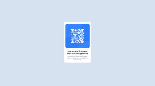
QR component, using HTML & CSS

Solution retrospective
Hello! This is my first ever challenge after learning HTML and CSS for a couple of weeks. I feel like I understand the visual aspects of the page. But in terms of positioning the container in the body and making it responsive based on device was something I'm unsure about.
I used Atom for my coding program and while I was making it I thought I had the position right, but after uploading to Github the qr component was in a totally different place.
I'd love how to the best practices for responsive designs!
Thank you!
Please log in to post a comment
Log in with GitHubCommunity feedback
- @rachit0706
Congratulations for completing your first challenge!! There are few suggestions for improving your code:
- Wrap the whole content inside a main tag for better semantics.
- You can use flexbox with flex direction as column on your main tag to center the qr component in the page. Here are some helpful resources: https://css-tricks.com/snippets/css/a-guide-to-flexbox/, https://www.w3schools.com/css/css3_flexbox.asp https://flexbox.tech/
- Using flexbox in the card will also fix your layout issue and then you will not need to set position attributes in the card.
- You can set font family in the body selector itself instead of repeatedly setting in sentence 1 and 2.
If you have any more doubts you can reply to this feedback.
Marked as helpful - @correlucas
👾Hi Candace, congratulations on your solution!👋 Welcome to the Frontend Mentor Coding Community!
Great solution and a great start! From what I saw you’re on the right track. I’ve few suggestions for you that you can consider adding to your code:
- Fix the component responsiveness, its not working yet and this is due the
fixed widthyou've applied to the container. The difference betweenwidthandmax-widthis that the first(width) is fixed and the second(max-width) isflexibleand make the element shrink when the screen starts to scale down. So if you want a responsive block element, never usewidthchoose ormin-widthormax-width. - Add a margin of around
margin: 20pxto avoid the card touching the screen edges while it scales down. - Use relative units as
remoreminstead ofpxto improve your performance by resizing fonts between different screens and devices. These units are better to make your website more accessible. REM does not just apply to font size, but to all sizes as well.
Here's my solution for this challenge if you wants to see how I build it: https://www.frontendmentor.io/solutions/qr-code-component-vanilla-cs-js-darklight-mode-nS2aOYYsJR
✌️ I hope this helps you and happy coding!
- Fix the component responsiveness, its not working yet and this is due the


Join our Discord community
Join thousands of Frontend Mentor community members taking the challenges, sharing resources, helping each other, and chatting about all things front-end!
Join our Discord