Recipe page challenge on Frontend Mentor

Please log in to post a comment
Log in with GitHubCommunity feedback
- @KumaKorin
Hi there! 😊 I took a look at your solution, and it's really nice—great job! 🌟 Here's some feedback for you:
1. Semantic HTML
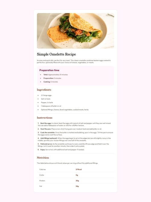
Your use of semantic HTML is spot-on! 🎉 Using
<section>,<h1>,<h2>, and<p>tags really helps with organizing the structure of your page. It makes it easier to understand and also improves accessibility for screen readers.One small suggestion: for the
<img>in the overview section, you might want to add a more descriptivealttext. Something like"A deliciously cooked omelette plated beautifully"would give more context to users who rely on screen readers!
2. Accessibility
You've done a good job with things like font size, spacing, and colors. However, there are a few areas that could be improved:
- Contrast: The text color (
hsl(30, 10%, 34%)) on the background color (hsl(330, 100%, 98%)) might be a bit low in contrast for some users. You could slightly darken the text or lighten the background for better readability. - Focus Styles: I noticed there aren’t any visible focus styles for interactive elements like links or buttons (if you plan to add them later). Adding focus outlines would make it more keyboard-friendly.
3. Responsive Layout
Your layout looks clean and structured! 🧹 The use of
max-widthin.containerand the centered content ensures it looks great on most screens. But you could check how it behaves on smaller screens (like below 400px width).For example:
- The padding on
.containermight feel a bit tight on very small devices. Maybe reduce it slightly for better spacing. - You could use a media query to adjust the font sizes (
font-size: 16pxinhtml) for better readability on mobile devices.
4. Code Structure and Reusability
Your CSS is super neat and well-organized! I love how you've used custom properties (CSS variables) for colors—so reusable! 💖 It would make it super easy to maintain if you want to tweak the design later.
That said, a small nitpick:
- In
.nutrition-section .nutrition:not(.nutrition-section .nutrition:last-child), the selector feels a bit verbose. You could simplify it to.nutrition-section .nutrition:not(:last-child)for better readability. 🎈
5. Design vs. Solution
The design looks pretty close to what I'd imagine the goal is! 🎯 The typography, spacing, and overall aesthetic are very pleasing. One thing to double-check is the spacing between sections—it might vary slightly from the design based on the
marginandpaddingvalues.
Final Thoughts
Overall, you've done an amazing job here! 🎊 The code is easy to read, and the solution feels polished and professional. With a few minor tweaks (like improving contrast and checking responsiveness), it could be even better. Keep up the awesome work! 💪
Marked as helpful - Contrast: The text color (

Join our Discord community
Join thousands of Frontend Mentor community members taking the challenges, sharing resources, helping each other, and chatting about all things front-end!
Join our Discord