Skip to content
  • Unlock Pro
  • Log in with GitHub
Profile
OverviewSolutions
7
Comments
7

KumaKorin

@KumaKorinGarbage can180 points

I’m a mysterious individual who has yet to fill out my bio. One thing’s for certain: I love writing front-end code!

I’m currently learning...

React, Vue, Next.js, SCSS

Latest solutions

  • Responsive testimonials grid section using native CSS


    KumaKorin•180
    Submitted about 2 months ago

    1 comment
  • Responsive feature card using native CSS


    KumaKorin•180
    Submitted about 2 months ago

    1 comment
  • Responsive product card using native CSS


    KumaKorin•180
    Submitted about 2 months ago

    1 comment
  • Responsive recipe page using navite CSS


    KumaKorin•180
    Submitted 2 months ago

    1 comment
  • Responsive profile card using native CSS


    KumaKorin•180
    Submitted 2 months ago

    1 comment
  • Blog preview card using Native CSS


    KumaKorin•180
    Submitted 2 months ago

    1 comment
View more solutions

Latest comments

  • P
    Nikolay Prodanov•120
    @jitzerttok51
    Submitted about 2 months ago

    Testimonials grid section

    1
    KumaKorin•180
    @KumaKorin
    Posted about 2 months ago

    What's good:


    • Nice color variables setup! 🌈
    • Good responsive grid using media queries 📱💻
    • Clean class naming for profiles 👍

    Suggestions:


    Alt Text Missing

    Add descriptions to images (alt="Daniel Clifford portrait") for screen readers.

    HTML Semantics

    Use <article> instead of <section> for each testimonial card.

    You can do this.

    <section class="card_list">
      <article class="card card-1">
         .....
      </article>
      <article class="card card-2">
         .....
      </article>
    </section>
    

    Duplicate Code

    .card-2 and .card-4 both set text to white - this can be combined to avoid repetition.

    Mobile Spacing

    Check lower screen sizes - padding/margins might look tight on small phones.


    Keep up the good work! The layout structure looks very close to the design goal 🎯

  • Azhel•120
    @Azai4
    Submitted about 2 months ago
    What are you most proud of, and what would you do differently next time?

    finishing this project

    What challenges did you encounter, and how did you overcome them?

    finishing the project

    What specific areas of your project would you like help with?

    that is my positioning in the desktop view

    four-card preview

    1
    KumaKorin•180
    @KumaKorin
    Posted about 2 months ago

    Feedback on Your Solution

    Hi Azai4! Great effort on completing this project. Below, I'll provide some detailed feedback to help you improve and refine your code further. You're making progress, so keep going!


    1. Semantic HTML

    Your HTML structure is mostly well done, but there are a few areas that could be improved:

    • Header Tags: While you used 
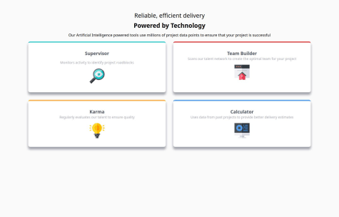
<h1> tags appropriately, using multiple <h1> elements (.first-text and .second-text) isn't ideal for accessibility and SEO. You should use a single <h1> for the primary heading and use <h2> or <h3> for subheadings.
    • Sectioning Elements: Consider wrapping each individual card in an <article> tag instead of a <div>. This makes the content more semantic and descriptive to screen readers.
    • Alt Text: The alt attributes for the images are descriptive, which is great! However, you might want to make them more meaningful for accessibility. For example, instead of "supervisor-card," you could use "Icon representing the Supervisor role."

    2. Accessibility

    Accessibility is an essential part of modern web development. Here are some suggestions to make your solution more accessible:

    • Font Size and Contrast: Ensure the text contrast is sufficient for readability, especially for the .paragraph class. The current light gray text on white might be challenging for visually impaired users.
    • Focus States: Add focus states for interactive elements (like buttons or links, if you have any) to ensure keyboard users can navigate smoothly.
    • Landmark Roles: Use ARIA landmarks (like role="main") or semantic elements (<main>) to help users with assistive technologies navigate the page.

    3. Layout and Responsiveness

    Your layout is functional and adapts to smaller screens. However, it doesn't fully match the design's three-column layout. Here's how you can address this:

    • Three-Column Layout for Larger Screens: In the original design, the cards are arranged in three columns, which is missing in your solution. You can achieve this by using grid-template-columns: repeat(3, 1fr) for screens larger than 1024px.
    • Spacing Between Cards: The gap between cards could be slightly increased to improve visual clarity.
    • Alignment: Ensure that the card alignment and text spacing are consistent across all screen sizes.

    4. Code Structure and Readability

    Your code is clean and easy to follow, but here are a few tips to make it even better:

    • CSS Variables: You've done a great job using CSS variables for colors and fonts. However, there seems to be a typo in the --Family variable. The font should be referenced as a string (e.g., --Family: 'Poppins', sans-serif;) instead of a Markdown link.
    • Redundant Classes: The .text class feels unnecessary since it's just a wrapper for text. Instead, you could directly style the elements (.header2 and .paragraph) within the card.
    • Box Sizing: Including box-sizing: border-box; globally is excellent! This makes layouts much easier to manage.

    5. Differences from the Design

    Your solution differs from the design in a few ways:

    • Column Count: As mentioned earlier, the design specifies a three-column layout on larger screens, whereas your solution stays at two columns. Adapting to the design's layout will make your solution more accurate.
    • Typography: The font sizes and weights in your solution don’t perfectly match the design. Double-check the design specs to ensure consistency.
    • Shadows and Borders: The box shadows and border-top colors look good, but they could be slightly refined to better match the design's subtlety.

    6. Suggestions for Improvement

    If you'd like to improve your solution further, here are some actionable steps:

    • Update your media queries to include a three-column layout for larger screens.
    • Refine the typography to match the design. Pay attention to font size, weight, and line height.
    • Add meaningful focus states for improved accessibility and usability.
    • Use semantic tags (like <article> and <main>) to enhance the structure and accessibility.

    Final Thoughts

    You're doing a great job, Azai4! Your solution demonstrates a solid understanding of HTML and CSS. While there are areas to improve, you're on the right track. Keep practicing, and you'll continue to see progress. If you have any questions or need further clarification, feel free to ask the community!

    Keep up the great work, and happy coding! 😊

  • Gabriel Rodriguez Perez•160
    @glrodriperez98
    Submitted about 2 months ago
    What are you most proud of, and what would you do differently next time?

    I'm most proud of how clean and responsive the final layout turned out, especially switching between desktop and mobile views. Getting the image to stack on top for mobile and sit beside the text on larger screens was a rewarding challenge, and I was happy with how well the design stayed consistent across devices.

    If I were to do it again, I'd pay even closer attention to accessibility from the start, including better semantic elements and alt text. I’d also consider adding a light hover animation or small transitions to the button to enhance the interactivity.

    What challenges did you encounter, and how did you overcome them?

    One of the main challenges was vertically centering the card while keeping the attribution text positioned properly on the page. Initially, my layout was causing the attribution to sit awkwardly to the side of the card instead of below it.

    I overcame this by restructuring the HTML to wrap both the card and attribution inside a container div, and then using flex-direction: column with align-items: center to stack everything properly. I also used gap to space out the content without needing extra margins. Though I believe I've seen feedback on others projects NOT to use gap...so any advice on the proper usage would be appreciated.

    Another challenge was handling the responsive image layout, especially making sure the card image resized nicely and aligned well with the text. I resolved that by using percentage-based widths and media queries to switch flex directions between row and column layouts.

    What specific areas of your project would you like help with?

    I’d love to get feedback on how to make the layout even more scalable and maintainable, especially when dealing with more complex designs or components. Specifically:

    • Are there any best practices for structuring the layout that I could use to make future projects easier to scale?

    • What’s the best way to approach fluid typography and spacing that adjusts more elegantly across breakpoints?

    • Are there accessible or semantic HTML improvements I can make to strengthen the structure further?

    Product Review Component using Flexbox and Media Query

    1
    KumaKorin•180
    @KumaKorin
    Posted about 2 months ago

    Hello Gabriel! 😊 Great job on completing this project—it looks fantastic! 🌟 Here’s some quick feedback:


    Semantic HTML

    • You've used semantic tags like <main> and <h1>, which is great! Wrapping the .card in an <article> could make it even more meaningful.

    Accessibility

    • Alt text for images is a nice touch! For the cart icon, consider using aria-hidden="true to prevent redundancy with the button text. Adding :focus styles would also improve keyboard navigation.

    Responsiveness

    • Your card adjusts well on smaller screens, and the column layout is clean. However, the heading font size (1rem) could be slightly larger for readability.

    Code Structure

    • The use of CSS variables makes your code maintainable—great job! Grouping related styles (like typography) could improve readability further.

    Design Accuracy

    • Your solution closely matches the design! 🥳 Just double-check spacing and line-heights for any small inconsistencies.

    Overall, this is a strong and polished solution! Keep up the awesome work, Gabriel! 🚀

    Marked as helpful
  • MgMyatHtayKhant•220
    @MgMyatHtayKhant
    Submitted 2 months ago

    Recipe page challenge on Frontend Mentor

    1
    KumaKorin•180
    @KumaKorin
    Posted 2 months ago

    Hi there! 😊 I took a look at your solution, and it's really nice—great job! 🌟 Here's some feedback for you:


    1. Semantic HTML

    Your use of semantic HTML is spot-on! 🎉 Using <section>, <h1>, <h2>, and <p> tags really helps with organizing the structure of your page. It makes it easier to understand and also improves accessibility for screen readers.

    One small suggestion: for the <img> in the overview section, you might want to add a more descriptive alt text. Something like "A deliciously cooked omelette plated beautifully" would give more context to users who rely on screen readers!


    2. Accessibility

    You've done a good job with things like font size, spacing, and colors. However, there are a few areas that could be improved:

    • Contrast: The text color (hsl(30, 10%, 34%)) on the background color (hsl(330, 100%, 98%)) might be a bit low in contrast for some users. You could slightly darken the text or lighten the background for better readability.
    • Focus Styles: I noticed there aren’t any visible focus styles for interactive elements like links or buttons (if you plan to add them later). Adding focus outlines would make it more keyboard-friendly.

    3. Responsive Layout

    Your layout looks clean and structured! 🧹 The use of max-width in .container and the centered content ensures it looks great on most screens. But you could check how it behaves on smaller screens (like below 400px width).

    For example:

    • The padding on .container might feel a bit tight on very small devices. Maybe reduce it slightly for better spacing.
    • You could use a media query to adjust the font sizes (font-size: 16px in html) for better readability on mobile devices.

    4. Code Structure and Reusability

    Your CSS is super neat and well-organized! I love how you've used custom properties (CSS variables) for colors—so reusable! 💖 It would make it super easy to maintain if you want to tweak the design later.

    That said, a small nitpick:

    • In .nutrition-section .nutrition:not(.nutrition-section .nutrition:last-child), the selector feels a bit verbose. You could simplify it to .nutrition-section .nutrition:not(:last-child) for better readability. 🎈

    5. Design vs. Solution

    The design looks pretty close to what I'd imagine the goal is! 🎯 The typography, spacing, and overall aesthetic are very pleasing. One thing to double-check is the spacing between sections—it might vary slightly from the design based on the margin and padding values.


    Final Thoughts

    Overall, you've done an amazing job here! 🎊 The code is easy to read, and the solution feels polished and professional. With a few minor tweaks (like improving contrast and checking responsiveness), it could be even better. Keep up the awesome work! 💪

    Marked as helpful
  • Christian Gabriel Lara López•80
    @chrislara01
    Submitted 2 months ago

    Responsive social links card using flexbox

    1
    KumaKorin•180
    @KumaKorin
    Posted 2 months ago

    Awesome job! 🌟 I like how clean the colors look and the buttons change color when I hover! Here's just 3 small things I noticed (maybe helpful?):

    1. Cool card width Maybe make the card narrower on big screens? On my laptop it looks reaaally wide 😅 Maybe add max-width: 340px?

    2. Better button sizes The social buttons look a bit uneven? Maybe make them same width using min-width: 250px? (I saw this trick online!)

    But honestly it looks way better than anything I could make! The colors are perfect and I love the round avatar! 😍 Keep coding~! 🎉

    Marked as helpful
  • Monica Nkiri•90
    @Luwisky
    Submitted 2 months ago

    figma, vscode, chrome.

    1
    KumaKorin•180
    @KumaKorin
    Posted 2 months ago

    1. Semantic HTML

    • But, did you know there’s no such thing as <h7> in HTML? 🤔 Maybe consider using a <span> or <p> instead and style it with CSS. Using proper semantic tags is super important for accessibility and SEO!

    2. Accessibility

    • Good stuff: Your design is clean and easy to understand, yay! 🎉
    • Improvements:
      1. Alt for images: Don't forget to add alt attributes to your images in HTML! It helps screen readers understand what the image is about.
      2. Focus states: You added a hover effect on .component (which is awesome, by the way 😄), but what about keyboard users? Maybe you could add a similar :focus state for better accessibility!

    3. Responsiveness

    • I love that you added a media query for screens under 500px! It’s so nice to see that .component shrinks to 90% width and the profile image adjusts too. 🌟
    • But, um, what about larger screens (like desktops)? Maybe you could think about adding styles for screens wider than 1200px to make it look even better on big monitors! 🖥️

    4. Code Structure

    • Your CSS looks neat and organized! The class names are super clear, so it’s easy to guess what they’re doing. Nice job! 🥳
    • But… I noticed a few repetitive rules, like margin-left: auto; margin-right: auto;. Maybe you could move those into a reusable class or a parent container? It’ll save you some work later!
    Marked as helpful
View more comments
Frontend Mentor logo

Stay up to datewith new challenges, featured solutions, selected articles, and our latest news

Frontend Mentor

  • Unlock Pro
  • Contact us
  • FAQs
  • Become a partner

Explore

  • Learning paths
  • Challenges
  • Solutions
  • Articles

Community

  • Discord
  • Guidelines

For companies

  • Hire developers
  • Train developers
© Frontend Mentor 2019 - 2025
  • Terms
  • Cookie Policy
  • Privacy Policy
  • License

Oops! 😬

You need to be logged in before you can do that.

Log in with GitHub

Oops! 😬

You need to be logged in before you can do that.

Log in with GitHub

Oops! 😬

You need to be logged in before you can do that.

Log in with GitHub

Oops! 😬

You need to be logged in before you can do that.

Log in with GitHub

Oops! 😬

You need to be logged in before you can do that.

Log in with GitHub

Oops! 😬

You need to be logged in before you can do that.

Log in with GitHub

Oops! 😬

You need to be logged in before you can do that.

Log in with GitHub

Oops! 😬

You need to be logged in before you can do that.

Log in with GitHub

Oops! 😬

You need to be logged in before you can do that.

Log in with GitHub

Oops! 😬

You need to be logged in before you can do that.

Log in with GitHub

Oops! 😬

You need to be logged in before you can do that.

Log in with GitHub

Oops! 😬

You need to be logged in before you can do that.

Log in with GitHub

Oops! 😬

You need to be logged in before you can do that.

Log in with GitHub

Oops! 😬

You need to be logged in before you can do that.

Log in with GitHub

Oops! 😬

You need to be logged in before you can do that.

Log in with GitHub

Oops! 😬

You need to be logged in before you can do that.

Log in with GitHub

Oops! 😬

You need to be logged in before you can do that.

Log in with GitHub

Oops! 😬

You need to be logged in before you can do that.

Log in with GitHub

Oops! 😬

You need to be logged in before you can do that.

Log in with GitHub

Oops! 😬

You need to be logged in before you can do that.

Log in with GitHub

Oops! 😬

You need to be logged in before you can do that.

Log in with GitHub

Oops! 😬

You need to be logged in before you can do that.

Log in with GitHub

Oops! 😬

You need to be logged in before you can do that.

Log in with GitHub

Oops! 😬

You need to be logged in before you can do that.

Log in with GitHub

Oops! 😬

You need to be logged in before you can do that.

Log in with GitHub

Oops! 😬

You need to be logged in before you can do that.

Log in with GitHub

Oops! 😬

You need to be logged in before you can do that.

Log in with GitHub

Oops! 😬

You need to be logged in before you can do that.

Log in with GitHub

Oops! 😬

You need to be logged in before you can do that.

Log in with GitHub

Oops! 😬

You need to be logged in before you can do that.

Log in with GitHub

Oops! 😬

You need to be logged in before you can do that.

Log in with GitHub